The renders look good Zell but the background looks blurry and dirty so it doesn't go with them at all
Try using more high quality pics for the bg and go easy on the white stripes

The renders look good Zell but the background looks blurry and dirty so it doesn't go with them at all
Try using more high quality pics for the bg and go easy on the white stripes


Point taken.
Although sadly good quality dot hack images are hard to find. When I stumbled upon this renders it was as if I had hit jackpot.
The backgrounds are conceptual art from the same game. Yet the blurry effect was supposed to be there, to give the renders the focus, instead of the background. The dirty part I do feel it, but like I said... hard to find good quality dot hack images. It may be popular among some of us... yet not among scanners it seems.
Anyway... when I'm at home I'll try hunting better scans from where I got the backgrounds. Thanks for the pointers Archie.
BTW... white stripes?
You know, the white scalines
Try setting the opacity a little lower
I currently have them at 10% as Lucifus suggested when he posted them.
What level do you recommend (for when Im at home tonight that is...) 5%?
It varies from background to background ( in my opinion anyway )
You can also try to set them to soft light, thats how i did it for the Death The Kid banner


RZ, as you mightve noticed theyre all the sameeee. the renders are nice its kinda a shame you didnt do some other things with the bg's.
Like I said... first time touching Photoshop to do this. I even had to seek google to find HOW to mirror an image :P
haha true well in that case. great job.

I like the second one better. It might do it some good to remove the feathers at the center of the sig, and maybe smooth out the shades of the character render to make it match the blending of the BG more.
Peace.

I like the second one, as well. If you can move Suigintou just to the left a little, it would be perfect. I would also remove the Gotwoot.net at the bottom left. Other than that, they're nice.
I am training in the shadows.
Currently playing: All of your games, probably.
how do I do that? or more precisely.. what exactly do you mean? I made her a bit "darker" because the BG colours are also dark here .. (and tried to remove the feathers and the "Gotwoot.net")maybe smooth out the shades of the character render
what kind of tool should I (or do you) use for smoothing?
looks a bit empty in my opinion but maybe it's just me who thinks so
I can't place the render any further to the left, because the render doesn't "allow" it... her black wing ends exactly at that point
edit
@ below
Ok I guess I'm not skilled enough or it was a mistake that I didn't save a version before I put in the render :/
Or maybe Gimp can't do it the way... I tried to find a tool which makes the render faint a bit into the background but both the smude and blurring tool make it look somewhat weird.
I woudn't mind if someone shows me how they'd do it though
well here are 2 version
the first is mainly the version before just a bit brighter...
seems like here is my limit for the moment, sry :/
if anyone really thinks it's worth improving or wants to use it, then go ahead
as I said I wouldn't mint it if someone shows me what you mean
Last edited by KrayZ33; Thu, 02-05-2009 at 02:13 PM.
I didn't mean to make the render darker. I like the previous brightness more.
What I meant by smoothing it out is use the blur tool or the smudge tool to let the shades blend with the flat colours. It'll help make the image look more in sync with the more realistic BG.
Peace.
Oh, I thought the image was placed on there. Nevertheless, some smoothing and other quirks would do the trick. As for the emptiness, you could place another Rozen Maiden character on there, though only one comes to mind when I think of "dark".Originally Posted by KrayZ33
I am training in the shadows.
Currently playing: All of your games, probably.
I guess none of the new banners passed approval, based on the lack on updates and the lose of interest on the users. LOL. Oh well.
Some of the old banners do need to be replaced, with the exception of some. These new banners simply cover the new seasons of the year, and they are pretty great.
I am training in the shadows.
Currently playing: All of your games, probably.


haha, I went through this entire thread today, and I must say... you guys have some real talent! I'm kinda burnt out on online games right now, so I think I'm going to try my hand at some banners and sigs, etc.
One thing I did notice though is: many of the banners that you guys have created are missing the darker black shadow effect that rides up the side of the white section of the forums on the outsides. Also the very top 'GotWoot?' bar is missing it too... I'll see about editting the top bar at least and PM'n it to Comp unless someone else gets around to it before me.
It's been a while since I've done any graphic design, so who knows how long it will take me... hehe
Again though, great work guys! It really made my day!


Right click on the rotating banner image at the top (rotate.php) and open it on a new page. You'll notice that that is the only part of the banner that needs modification when making a new banner. The rest is all part of the standard layout of the site.
hrm, I can't open it in a new window here at work for some reason, but I'll try it when I get home.buuuuut, I think I know what you're saying...
I've got banner fever again, so here you go
Kishin from Soul Eater
Special thanks to Psyke on this one
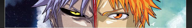
Ichigo and Hichigo from Bleach
The first one is a cheap crop from a great wallpaper i found with just some color modifications
The second one is also a crop but with some modifications on the background and color
 Posting Permissions