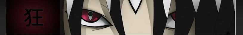
I like how you incorporated "insanity" into there.. Is it possible for him to look a bit more...insane?


I like how you incorporated "insanity" into there.
If it's not Isuzu-chan Mii~


Originally Posted by Archangel
yeah looks like your "crops" didnt grow very much. must be a drought? = /
Translation:
Buaaa why hasn't anyone added my banners yet? I need attention
I don't think Masa bothers with them, and Comp hasn't shown his face for a while.
If it's not Isuzu-chan Mii~
sorry, i just think they have good potential. mind if i tried workin with em?
Sure, go ahead
You'll probably just end up cluttering them with excessive special effects and lighting like usual ...
yeah.. probly.
started with the one I liked the most....
hmmm too much contrast?
heres it with less

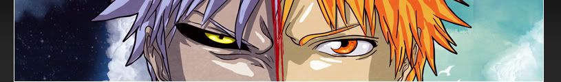
The second one is the best. Much improved over the original (no offense Archie) without going too far. It looks like an acrylic painting, which is a nice effect.
I actually like the original a little more (no offence kage), but only because I like the direct black and white contrast, without the extra colours. Feels like yin and yang.
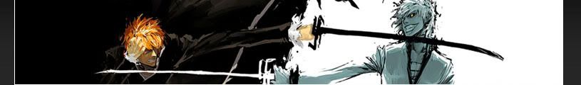
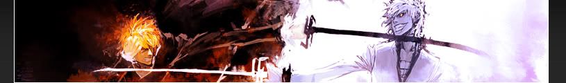
The one I think that can be worked on the most is Archie's first one (the Soul Eater one). You should give that a shot kage.
Peace.
That's what i was going for
Hey he can't mess with the first one :S
I said it was ok to mess with the second and third because i just stole them from other wallpapers and just messed with the colors, but the first one is all me.

I actually like what kage did more, the extra paint makes it feel even more ying and yang then before. Ichigo seems far more troubled now with the extra smudges, while ogichi, even though its white, feels far more sinister due to the smoke like effects.

Kage I like your first better than your second version of the Ichigo banner.
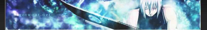
I only see a gradient with some text. Did you make the soul render dude?
I'm the one who took the screenshot and made the render out of it so no, you can't use it ...
Maybe you should try, you know, actually come up with an original concept yourself?

well now it looks like Fire and Ice and it's more artistic in my opinion

....The banner in general, whatever wallpaper it was taken from is not all that great.
I don't especially like either. The conflicting "aura's" just clash too abruptly. Theres no need to fight over it.
But if I had to choose one, it would be Kage's first version with the contrast.
who's fighting? I still cant decide who's version I like more... its a close one.
and arch, I seem to lack inspiration. But your bleach banner gave me a few ideas so I ran with it, sorry if I stepped on your toes a little there brotha. I look at it more as a collabo anyway, with you doing the most of the work by laying down the concepts.
But thanks everyone for your input you got me in the mood to start one of my own now.
Well i do agree with that
It's obvious you have alot more experience with Photoshop than i do but i guess o have more of knack for finding fun and interesting concepts for these banners
Lol actually i think we'd make a pretty good team
Felt like er, not even an anime banner, so I doubt its going up. Just loved the render.
Ezio - Assasins Creed 2

really sweet concept luciiii... just a few ideas from me;
I love the red firey brushing on the right side round his arm. If you could make a similar one on the opposite side where his other arm is just like you have it... would look sick. Im thinking blackish flames?
and lastly, idk if its the scanlines or the lighting but the assasin brotha pops more than a jack in the box.
FINALLY made one of my own. Hope its renowned across the land, spent too much time on it.
Last edited by Kagemane_no_Jutsu; Sat, 06-27-2009 at 05:15 AM.
 Posting Permissions