Page 9 of 12 FirstFirst ... 56789101112 LastLast
Results 161 to 180 of 226

Thread: New banners for the forum

  1. #161
    Remnant of Woot Lucifus's Avatar
    Join Date
    Sep 2005
    Location
    Photoshop, Eclipse, Notepad
    Age
    33
    Posts
    1,949
    @ RyougaZell - Love the Alkaid Render. Your banners nice and colorful. =)


    Its pretty kool that so many newcomers are throwing up there work for the Banner rotation. Keep letting em out people, then ya should definitely try your luck with some signatures.

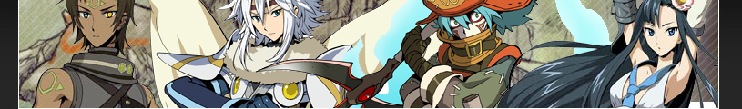
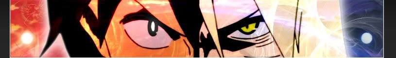
    Anyway, heres a few I made while waiting for Kara no Kyoukai to finish. Simple ones, so as not to discourage the new faces here on GW.

    I'll try something a little more in depth and time consuming in a couple days, then PM Complich with the best of the bunch from everyone here. I don't think he frequents the fanart section very often. =P


    @Ryllharu - Mind your render placement, and most definitely watch the empty space ya have going there.

    Check out http://www.planetrenders.net/ Render quality is also a factor you've gotta watch out for. Now try that again and give the render a bit more of a close up.

    I know ya got the urge to fit everything in there, like we all once had, and still do; but ya gotta know when to fold your deck. =P Nice first try.

    Good luck. Looking forward to your artwork mate.
    Last edited by Lucifus; Sat, 01-31-2009 at 04:35 PM.
    Don't believe in yourself, believe in me, who believes in you.


  2. #162
    Procacious Polymath Ryllharu's Avatar
    Join Date
    Mar 2004
    Location
    American Empire
    Age
    39
    Posts
    9,849
    Quote Originally Posted by Lucifus
    @Ryllharu - Mind your render placement, and most definitely watch the empty space ya have going there.

    Check out http://www.planetrenders.net/ Render quality is also a factor you've gotta watch out for. Now try that again and give the render a bit more of a close up.

    I know ya got the urge to fit everything in there, like we all once had, and still do; but ya gotta know when to fold your deck. =P Nice first try.

    Good luck. Looking forward to your artwork mate.
    I knew the negative space would be one of the largest problems with it, but I didn't think I was far off on the ratio of negative space most of the current banners have, particularly the older ones.

  3. #163
    Remnant of Woot Lucifus's Avatar
    Join Date
    Sep 2005
    Location
    Photoshop, Eclipse, Notepad
    Age
    33
    Posts
    1,949
    Heh, I hear ya mate.

    @ ArchAngel, GratZ Arch. You banners made the cut. And I gotta say, they're looking nice.
    Don't believe in yourself, believe in me, who believes in you.


  4. #164
    Procacious Polymath Ryllharu's Avatar
    Join Date
    Mar 2004
    Location
    American Empire
    Age
    39
    Posts
    9,849
    Okay, back for another shot.

    I thought about dropping in an image of Alto, but it never really seemed to fit too well. Some of the best art I could find were of Alto-hime (gender bender kind and not just in costume). So I opted for a VF-25 instead. I lose a part M82 (galaxy in the bg) I liked, but it helps cut down on the dominating negative space I had on the right side.


    ...and a plus-Klan mascot version.


    If the trend is to keep the scanlines off of the characters, that's a quick fix.

    EDIT:
    Starring at it some more, now I might have too much going on.

  5. #165
    Wild Card Fool RyougaZell's Avatar
    Join Date
    Aug 2004
    Location
    Mayonaka TV
    Age
    43
    Posts
    5,593
    I need help with texts. I didn't add none because I suck on making them on PhotoShop

    Two More...

    Persona 3


    Persona 4

  6. #166
    Banned darkshadow's Avatar
    Join Date
    Apr 2005
    Location
    Phantom Zone
    Age
    38
    Posts
    4,117
    My quick shot at something that spawned from DO wanting boobs:


    -----------------

  7. #167
    Pit Lord shinta|hikari's Avatar
    Join Date
    Jan 2006
    Location
    The Pits
    Age
    37
    Posts
    10,450
    Blog Entries
    1
    @RZ - I like the hack one. For the persona set, I think the render edges need to be cleaned up a bit. The white crop lines are quite visible upon closer inspection. Also, maybe you can try changing the BG colour. They all seem to be green.

    @Luc - as much as I enjoy your style, I think that you had better spend the time trying out something completely different. Everyone knows you have more than enough talent for it. Maybe you can come up with an even better style than what you have been doing so often recently.

    @Ryll - I think the VF can be used as a BG effect instead of simply being an image placed as a render. If you enlarge it and drop opacity, it might give the BG more depth and kill the blank space around the two characters. Upping the contrast/brightness for the character renders should also help bring them out.

    @DS - Sorry, but whose boobs are those?
    <img src=https://ibb.co/1dDDk6w border=0 alt= />
    Peace.

  8. #168
    Procacious Polymath Ryllharu's Avatar
    Join Date
    Mar 2004
    Location
    American Empire
    Age
    39
    Posts
    9,849
    Hopefully, this one will do it. One with a VF and one without. I think I hit a balance on the negative space by moving the characters out over more of the starfield on the right side, exposing more of the colorful bg.

    I am also curious to whom those boobs belong to...


  9. #169
    Banned darkshadow's Avatar
    Join Date
    Apr 2005
    Location
    Phantom Zone
    Age
    38
    Posts
    4,117
    Its Tendo Rushuna from Grenadier, you know... the girl that defeats you by smiling and giving you hugs with her twins.
    Another real quick one before I go to bed:

    -----------------

  10. #170
    It wasn't much Archangel's Avatar
    Join Date
    Feb 2008
    Location
    Portugal
    Age
    34
    Posts
    10,833
    Blog Entries
    3
    Quote Originally Posted by shinta|hikari
    @DS - Sorry, but whose boobs are those?
    ... does it matter?

  11. #171
    Saeba Ryo... awesome.

  12. #172
    Wild Card Fool RyougaZell's Avatar
    Join Date
    Aug 2004
    Location
    Mayonaka TV
    Age
    43
    Posts
    5,593
    Cleaned a bit more as Shinta recommended. Best I could do with my newbiness to photoshop =P


    About the greeneiss... I hadn't noticed lol... I just chose a field for the hack one, the green sky of the dark hour for P3 and the fogged inaba murder scene for P4

  13. #173
    Pit Lord shinta|hikari's Avatar
    Join Date
    Jan 2006
    Location
    The Pits
    Age
    37
    Posts
    10,450
    Blog Entries
    1
    Wow, great job guys, and just a little bit after I suggested some changes.

    @Ryll - I like the second one better, since the great render should be the focal point. The BG complements the render well in that banner. Well done.
    <img src=https://ibb.co/1dDDk6w border=0 alt= />
    Peace.

  14. #174
    It wasn't much Archangel's Avatar
    Join Date
    Feb 2008
    Location
    Portugal
    Age
    34
    Posts
    10,833
    Blog Entries
    3
    After watching 27 Gurren Lagann episodes in one day i had to make a banner about it


    I decided to do something more colorful than i used to, but the thing is that the scanlines absolutely rape it to death so i ditched them this time

    I think i'm on the right path but there's still something missing, any thoughts?

  15. #175
    I think the main problem is that Kamina looks like a moron.

  16. #176
    RIP SOUL'd OUT :( Marik's Avatar
    Join Date
    Jul 2008
    Location
    2,000 light years away
    Posts
    5,887
    How about more Yoko, and less of those other guys. Some Kiyoh, Kinon, and Kiyal would be nice too.

  17. #177
    if youre gonna take the time to post in here might as well post some nice good quality pictures of the char's you'd like to see used. takes another 5 mins in google maybe... if you need an example of what isn't useable and what is lemme know. but i'd hope anyone with a little sense could figure it out.

    been pretty busy lately but since my WoW subscription is over and no funds to bring it back to life im sure i'll get to making a few soon enough.

  18. #178
    Procacious Polymath Ryllharu's Avatar
    Join Date
    Mar 2004
    Location
    American Empire
    Age
    39
    Posts
    9,849
    For popular series like Gurren, you can get loads of high quality fanart, doujin covers, or even homage artwork by other artists off danbooru. That's where I get most of the stuff I'm using. The resolutions are usually very high too. There are image sites were everything comes in high resoultions too, if you want to go overboard.

  19. #179
    It wasn't much Archangel's Avatar
    Join Date
    Feb 2008
    Location
    Portugal
    Age
    34
    Posts
    10,833
    Blog Entries
    3
    Ok ok, enough bitching about the render -_- ( i liked it... )

    VS.01


    VS.02


    VS.03


    The background here has a double meaning for the render i used, like light and dark side combining forces for a common goal just like the night and the day join in the between

    Personally i prefer the second one but you guys tell me what you think.

    As you can see from the first line, criticism is encouraged ( it rly is )

  20. #180
    Wild Card Fool RyougaZell's Avatar
    Join Date
    Aug 2004
    Location
    Mayonaka TV
    Age
    43
    Posts
    5,593
    More hack goodness (reposted the 1st one to be together)


    Haseo, Alkaid, Atoli and Kite

    Albireo, Balmung, Azure Kite and Midori

    Tsukasa, Subaru, Tabby and Ovan

    Orgel, Posaune, Geist and Fluegel

Posting Permissions

  • You may not post new threads
  • You may not post replies
  • You may not post attachments
  • You may not edit your posts
  •