How about introducing new Bleach and Naruto: Shippuden banners for the forum?


How about introducing new Bleach and Naruto: Shippuden banners for the forum?


sure, go make some banners and we'll see if they'll be approved
Well I don't know the first thing about making a banner. How about moving this thread to the fanart section and see if we get any takers?

request granted.
this could be a very good idea for a contest...
edit to below- ugh, that is annoying... where's ciber when you need him?
Last edited by masamuneehs; Sun, 02-25-2007 at 04:46 PM.
Humans are different from animals. We must die for a reason. Now is the time for us to regulate ourselves and reclaim our dignity. The one who holds endless potential and displays his strength and kindness to the world. Only mankind has God, a power that allows us to go above and beyond what we are now, a God that we call "possibility".

http://forums.gotwoot.net/gotwoot/im...dom/rotate.php
If you load up one of those banners, you'll see that it has dark bars on the sides. Is the CSS designed to take in pictures of 815 width with black bars or is are those black bars added by the image rotation thing?

If you can promise me no more scanlines, I'm down.


What are the requirements to be a GW banner? Scan lines and a certain size xD?

Oh yeah, I was gonna add those... after some compression that is. They're part of the rotation.
Requirements:
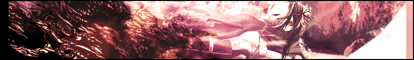
- Dimensions = 815x120px
- Side borders: match other banners (ie: slight charcoal-color gradient, unbroken white line borders). More generally, don't break the layout..
- Scan lines, in the image only, not in the borders. No real formal requirement on how they are, but don't go too crazy with them. Subtle is good. (I don't really know why for the scanlines... it's a Ciber thing ...). Anyway, try to match the status-quo...
- Lay off the blur effect. If your image looks like an impressionist painting, it's not going up. If it looks like I've got cataracts, it's not going up.
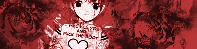
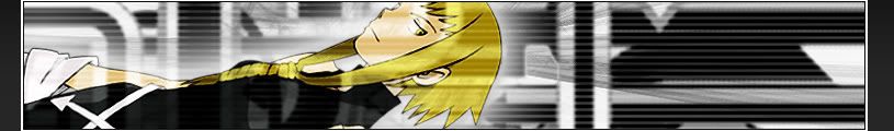
- Image content must be safe for work, and must be anime-themed. Preferably themed from a series that received significant discussion here while it was airing.
- Your image format should be .jpg or .png. If you give me a .png, I'll likely convert it to a .jpg with ImageMagick. I don't have anything against png's, just that with drawing close to 40 banners in the rotation now and all of them being jpegs already, a png would be sort of out of place. Needless to say (because I'm asking for jpegs), no animations will be considered.
- Image size under 100K. Under 60K is preferable if you can do it. If you can't or don't bother, but I like your image, I'll drop the quality a couple percent with ImageMagick and making sure it doesn't look like crap at a lower jpeg quality setting before posting it. But if you don't want me brutalizing it with software beyond your control, you should consider meeting this one...
- Most importantly, it has to impress me enough decide that it's worth spending the time to post (including changing formats and compressing it further, if I deem it necessary). Generally, I like anything that has a decent design sense, good colors, uses the space reasonably well and is reasonably interesting without being too distracting.

Awesome new ones.
But now my sig won't be that uncommon =(
Hmm.... only one of those appears to be showing up for me... I'll have to follow up on that later.
I've been considering an upgrade to the latest vbulletin for like the last 2 years (even more the last 2 months thanks to vb3.7), but it means gigantic migration and basically re-themeing the forums from scratch, because of the number of changed and updated templates, functions and hooks. I'm no graphic designer (... just look at my sig for evidence there
I'd love to update the look and feel of the forums, and get a bunch of the new features of 3.6 and 3.7 (ajax reputations, edit history, built-in image gallery, tagging, relationship stuff, wall-style public messaging, user-defined usergroups, tons of other cool shit). But I just don't have the motivation to fix the theme or make a new one...

Lucifus delivers again, those are great looking. I hope to see a forum upgrade soon.
"Be sure to take this piece of $#!t(meant sheet)" - My dynamics professor(heavy japanese accent)
Sig and Avatar by Lucifus
Current Games: League of Legends(Fuck, its got me hooked again -_-)

The first two are definitely keepers

I planned to do like 10 decent ones tonight, but had some creepy shyt happen at my house and been too spooked to set foot back in my room till now. -_-
So i'll post the only two I have done so far.
I feel a few shiny new banners will be a nice breath o fresh air.
This is from my last banner update, I like er; maybe Complich didnt see em. Lets send a pm eh.
[IMG]
Can i also have a crack at it?
Haven't used photoshop in a while, this would be a good opportunity to get some of the rust off
Lucifus: Nice. Added...
Kagemane_no_Jutsu: Interesting, but yer doin it wrong. Matching the borders is a requirement. The diagonal pinstripe thing ... maybe not so much, I dunno.
Archangel: Sure, just make sure you pay attention to the images that already exist as examples.
Can i use the series currently "En Fuego" ?
I'd love to see some Soul Eater banners up there
If they look pretty good and the format's right, I don't really mind either way.
Yeah... the rust isn't coming off as easily as i hoped
I know it's crap, but am i at least on the right track with the proportions?
Also i would appreciate some advice, especially since i just recently got CS4
Last edited by Archangel; Sun, 01-25-2009 at 06:22 PM.
ok, while the diagonal pinstripe thing is somewhat of a softer requirement, the horizontal lines .... that ain't gonna fly
Other than that, I dunno, if the borders match up (including the gradient, watch that...) then you might be on the right track. I've got no photoshop skills, so no advice for you on that one though.
 Posting Permissions