Hey lasaire hows this one for a Naruto sig?
Somehow the lil quote on the bottom seems a bit odd...
well here is it...


Hey lasaire hows this one for a Naruto sig?
Somehow the lil quote on the bottom seems a bit odd...
well here is it...
Animeniac, isn't that from the Meow Mix commercial?!
Yeah, that's a little strange, I'd definately change that unless bizarre humour is what you are going for ;-) Other than that, your composition is very nice! Good clean cutouts and a variation between all kinds of shots, you're really advancing!
Now, what you need to do is perhaps add a stroke or outer glow to the blue text in the top left to make it a bit more separate from the background, and start adding some careful texturing and opacity changes for more interest!
But really, this sig is a huge improvement from your first ones! Nice progress!
Zero, the sig I made for animeniac doesn't have any brush effects on it, but four layers with images:
1) Very faint layer with kyuubi's eyes. The opacity is turned down very low and it's on top of all the other layers.
2) Black and white fox-naruto from the fight with Haku. The layer mode is set to screen and the opacity is low.
3) Red fox naruto. This is actually two layers that are adjusted to be red and orange monochrome, with the top layer on color dodge and the opacity low.
4) Layer with Naruto's determined face. This is just a simple cutout from a screencap. Nothing special.
VagabondLBD, I'm working on your sig right now, sorry I didn't get to it last night but I was out all day and got back home very late.
R3n, that Orochimaru sig's really nice, and it lends itself well to the addition of text and other customizations for general use. Nice job.
Zero786, the textured background I use in my personal sig is done with an assortment of downloadable brushes for Photoshop. Try VBrush as a jumping off point for downloading. Thanks for the gifs offer, but I have imageready, I can do them myself.
Animeniac, still showing improvement, good! The Shikamaru one is very nice, though that background image looks oddly distorted. I can't stress enough though, avoid that beveled edge! Resist the temptation!
</div><table border='0' align='center' width='95%' cellpadding='3' cellspacing='1'><tr><td>QUOTE (ZeRo786 @ Feb 22 2004, 03:42 PM)</td></tr><tr><td id='QUOTE'>WOW how do u that effect, its amazing can u pleez tell me how. </td></tr></table><div class='postcolor'>
i found it a while back on www.good-tutorials.com

ill make karma a shikamaru sig, if thats what u want karma?
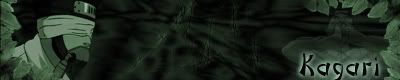
It looks awesome!!! But now i feel stupid because I can't figure out how to get it on there. SOMEONE PLEASE HELP ME!! oh and Kagari, I'm in your debt!!
Ok, since you asked for a critique, I'm going to get nitpicky! :wink:
Good choice of nice clean images, I esp. like the one on the right, but the edges of his hair are a touch jaggy, take your blur tool and gently go around the edges and that should fix it. You went a little too close with your lasso tool around the edge of Kiba and Akamaru on the left and cut out a bit of his outlines, more practice with selection tools will make you more comfotable with them. Don't be afraid to zoom in really obscenely close! I think when I was doing Vagabond's I was at 1600 at one point.
That gray background is just a touch...mmm...I don't want to say cheap, because I definately don't want to come across as insulting at ALL, but it is a bit bland. Try to avoid filter effects in general, they tend to be recognizable and non-unique. Give a bit of texturing, maybe have fun with some customizable brushes (says the Brush-Addict herself) and don't be afraid to download fonts, but watch out for the 3 font rule: Using more than three different fonts will make your piece too busy. Adding glow/gradient/stroke effects can sometimes count as a different font, so be careful and subtle with them.
Above all, play play play! In every one of my sigs there's at least two layers that I stuck in to experiment with images/composition/effects/brushes that I ended up turning off in the final version I posted. Just fudging around with filters on top of images, brushes on top of layers, etc. can sometimes give you cool effects that you would never figure out how to do if you specifically said, "Hey, I want to do this...." Plus, that's half the fun!
Great job, this thread is beginning to turn into what I hoped it would: an open forum with an equal number of sig makers and requesters!
Edit: Kiba, you need to have the image hosted somewhere, or have someone host it for you (littlecooldude will if you ask) and then put a link to the image in your signature.


Well, to get it in there, you have to go to your profile and choose to edit your signature. The host i'm using is pretty reliable, so you can just copy the link!
If you want to wait, however, I might revamp it a little using lasaire's critique. I'll work on it tomorrow. Glad you like it!
Oh, and lasaire, as always, your nitpicking is indeed appreciated...I already feel like my next one is going to be alot better. I did download those beast fonts, thoughThanks for the criticizm.

_________________________
lucky....
I'll wait until tomorrow and check it then, and also with it send me the site so i can put it on there. thanks for all the help its appreciated!!! I can't wait to see what you'll do with it!!!
Yay, sig happiness. Such a warm, fuzzy feeling I have now.
Now what I really want is that script SirCharlesIII seems to have that changes out his sig on every page view!
Where is the best place to go for naruto pics?


</div><table border='0' align='center' width='95%' cellpadding='3' cellspacing='1'><tr><td>QUOTE (ZeRo786 @ Feb 23 2004, 01:44 PM)</td></tr><tr><td id='QUOTE'> Where is the best place to go for naruto pics? </td></tr></table><div class='postcolor'>
You can get most anime pictures and screen caps here. http://www.xenogenesis.com/browse/entertai...nga/screencaps/
Hehe, congrats on your new title lasaire!
Thanks, AlbinoFury, and I'm glad to hear you're feeling better! :-)
The best place for Naruto pics is either naruto-kun.com's galleries or littlecooldude's site nartuopix.littlecooldude.com. Littlecooldude has the largest screencap collection, but naruto-kun.com also has calendar art and other manga artwork.
If somebody who's not planning on competing wants to start the challenge thread and pick out 5 or so images for all us contestants to use, go ahead! Let's get this thing started. I vote it should be one of the mods who's not actually going to submit, it's more objective that way.
</div><table border='0' align='center' width='95%' cellpadding='3' cellspacing='1'><tr><td>QUOTE (lasaire @ Feb 23 2004, 01:33 AM)</td></tr><tr><td id='QUOTE'> Yay, sig happiness. Such a warm, fuzzy feeling I have now.
Now what I really want is that script SirCharlesIII seems to have that changes out his sig on every page view! </td></tr></table><div class='postcolor'>
I believe the mod littlecooldude made one that does that, hes probably just using that.
heres another siggy ive done,thanks again lasaire

hey that is actually pretty cool. How did you do that effect
maybe we should decide here though what we want the pictures to be taken from for our little endeavor, we need to consider what anime? what characters? if we are gonna limit it that far. and then we can have someone submit pics or choose some images.
for kakahasi the effect is called light beam
takes time to make but looks good.
here is how the beam should look when u finished, the rest is just imagination. as you can see mine is very limited. so what do u think of it

 Posting Permissions

 Reply With Quote