There is a border. It's one of those hard light/vidid light/pin light type borders. To be honest I'm not a fan of those. A simple black 1 px is good enough for me any day of the week.Originally Posted by NarutoMaster


There is a border. It's one of those hard light/vidid light/pin light type borders. To be honest I'm not a fan of those. A simple black 1 px is good enough for me any day of the week.


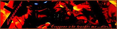
this is my new and last creation until mid terms are over.....comments welcomed.
edit: forgot i made another one. actually just added render and text to one i already made. comments welcomed
Last edited by dragonrage; Sat, 03-25-2006 at 04:04 AM.
___---------------------------- "THE DROPOUT CREW"--------------------------------________Deblas, IfingHateTonTon, RyougaZell, dragonrage.________
________ we may fuck up alot but we always pull thru.
Everything is nice except the render. Since I know which render you used, it doesn't look as bad to me. But a lot of people probably haven't seen that render before and to them it just looks like one big mess. I know you're going for that dark look, but make the render more visible for those not familiar with it.

Yeah...now that you told me this, I can somewhat see it. I always go for the black 1 pixel border on most of my sigs, its easy to see yet it still looks good at the same time. Don't really see the need to set a blending mode to the stroke of the border itself.
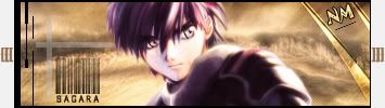
This fantastic Sousuke sig was made by the one and only Lucifus! Thanks man!
thanks man... the render i use was already dark thats why i liked it.. but i will try to brighten it a little more.... any suggestion on how i could brighten a render that was dark to begin with?... i am still pretty new to photoshop.
___---------------------------- "THE DROPOUT CREW"--------------------------------________Deblas, IfingHateTonTon, RyougaZell, dragonrage.________
________ we may fuck up alot but we always pull thru.
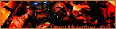
Read up on tutorials on level and curve. Mostly level if you just want to brighten or darken images. You'll be surprised at how dragging a slider back and forth can completely change the image.
played around with the level and this is what i came up with..
thanks BoC for the advice...
___---------------------------- "THE DROPOUT CREW"--------------------------------________Deblas, IfingHateTonTon, RyougaZell, dragonrage.________
________ we may fuck up alot but we always pull thru.

Dude! Great job, that is an all around great sig. The text is great too!

To me that sig is f*cking great man. You've got to be the best new guy yet.
@ Ton Ton
@ Lucifus
thanks man i am very happy that you like the Trigun sig
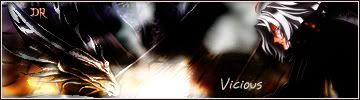
did you guys like the Vicious sig too??
___---------------------------- "THE DROPOUT CREW"--------------------------------________Deblas, IfingHateTonTon, RyougaZell, dragonrage.________
________ we may fuck up alot but we always pull thru.
It is really good, I am definatly liking it, but as BoC said, someone who doesn't know who he is would have a really hard time with the render.

Thanks for all the comments on my Zangetsu sig guys. Sorry I couldn't respond sooner but I was in NY and without internet.
Here's my latest sig.


that pretty cool but theres to much empty space IMO
Yeah, I usually make sure the sig itself looks good before I add text.
Tried adding text to the Zang sig. Any thoughts?

Last edited by xDarkMaster; Mon, 03-27-2006 at 09:53 AM.
@ xDarkMaster: I like the render you used in the naruto sig alot, the sig itself is sweet and once you add text it'll be even sweeter. The outline of the desktop pic looks good in the sig too. The Zang sig looked good to me from the start, that thing is absolutely awesome, and also looks even better with the text. Great stuff dude!

you new guys are seriously improving damn fast... i haven't made anything I'm proud of in the past month...
Xdark: love the naruto one, the render and the bg. Does seem to have too much empty space tho. I like the Naruto chalk outline in the background, but maybe you could do something like that in the other, more empty) part of the sig?
The zangetsu one has too much brushing going on on his right side. Also, maybe use a quote from Zangetsu rather than just 'bankai'?
Dragonrage: Where the fuck did you come from with making good sigs?
Humans are different from animals. We must die for a reason. Now is the time for us to regulate ourselves and reclaim our dignity. The one who holds endless potential and displays his strength and kindness to the world. Only mankind has God, a power that allows us to go above and beyond what we are now, a God that we call "possibility".
Thanks for the comments IFHTT and Masamuneehs. I am going to add some text to the Naruto one to make get rid of some of the empty space.
Do you have any ideas for a quote?
lol thanks man... for the compliment and encouraging me to join the discussions... drawing has been one of my oldest hobbies.. guess i just applied it to photoshop....it so freaking awsome. again i have to say thanks to all the guys that made all those great tuts.
@ xdarkmaster the naruto render looks sweet.... but like they said it a little empty and also the render color is clashing a little with the back ground.. just alittle... but its awsome non the less... have nothing to say about the zangetsu sig since he is my fav. character can't go wrong while using him.
Last edited by dragonrage; Mon, 03-27-2006 at 04:24 PM.
___---------------------------- "THE DROPOUT CREW"--------------------------------________Deblas, IfingHateTonTon, RyougaZell, dragonrage.________
________ we may fuck up alot but we always pull thru.
Okay here's hopefully the final version of my Zang sig.
And here's a fix on my Naruto sig.


That Naruto one is great, could you post that render in the render thread?
 Posting Permissions


 Reply With Quote