Page 197 of 337 FirstFirst ... 97147187193194195196197198199200201207247297 ... LastLast
Results 3,921 to 3,940 of 6729

Thread: New sig or wallpaper? show it off here!

  1. #3921
    Moderator Emeritus masamuneehs's Avatar
    Join Date
    May 2005
    Location
    a fountain pourin' like an avalanche, comin' down the mountain
    Age
    38
    Posts
    3,874

    i cannot work inside the system

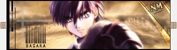
    i have finally gone through the tutorials, yet I still can't make myself go about creating sigs like that... I never thought that i could have an artistic 'style' so to say, but I guess I do, and it doesn't seem to want to budge to follow those tutorials...

    so, i made 2 versions of a new sig. Obviously they both need more work, and I think I went a little nuts with the brushing in the second one...


    this version seemed too empty and 'blue' for my tastes, and i wanted to play with a sorta pop-out style so I went to this one

    And then got annoyed that their heads were cut off so I adapted it again to:

    as always feedback is appreciated! Sorry that i'm a deviant and can't just stick to the simple render BG thing (tho the Itachi part technically is the BG, but altered quite a bit)

    perhaps I should try to get some studying in today...

    Humans are different from animals. We must die for a reason. Now is the time for us to regulate ourselves and reclaim our dignity. The one who holds endless potential and displays his strength and kindness to the world. Only mankind has God, a power that allows us to go above and beyond what we are now, a God that we call "possibility".

  2. #3922
    Graphics Whore Phoenix20578's Avatar
    Join Date
    Aug 2005
    Location
    Jersey
    Age
    36
    Posts
    1,879
    That final product looks great. The colors blend veryt nicely with the renders. Great job Masa!


    For all you awesome people, it's just Phoenix. The numbers are just the amount of times people misspell it.

  3. #3923
    Junior Sexfiend PSJ's Avatar
    Join Date
    Jul 2003
    Location
    At a bar
    Age
    35
    Posts
    5,104
    I like it to. The text however is bad. Re-work that so it fits with the general theme of the sig.

  4. #3924
    That text is extremely hard to read. Does that line come with the font? Because if it doesn't, get rid of it. Other than the text the sig is very nice.

  5. #3925
    I agree with all of the above Masa, change the font and that is one hell of a badass sig. Keep them rolling out, you're getting better and better.

  6. #3926
    Drifter dragonrage's Avatar
    Join Date
    Jan 2006
    Location
    if you find out tell me.....
    Posts
    1,229
    i agree the text need work, and as i said before it is awsome. Glad to see the tree is gone. I think you should add a border as well especially since it is white, kinda seperate the sig from the page, also make it look even better i think.
    ___
    ---------------------------- "THE DROPOUT CREW"--------------------------------
    ________Deblas, IfingHateTonTon, RyougaZell, dragonrage.________

    ________ we may fuck up alot but we always pull thru.


  7. #3927
    Moderator Emeritus masamuneehs's Avatar
    Join Date
    May 2005
    Location
    a fountain pourin' like an avalanche, comin' down the mountain
    Age
    38
    Posts
    3,874
    a border on a Pop-Out sig... how does that come to be exactly?

    I agree it would look better with some kind of border, but with this kind of sig I am clueless how to go about getting it...

    edit - thaks everyone for the feedback. that text will change soon.

    Humans are different from animals. We must die for a reason. Now is the time for us to regulate ourselves and reclaim our dignity. The one who holds endless potential and displays his strength and kindness to the world. Only mankind has God, a power that allows us to go above and beyond what we are now, a God that we call "possibility".

  8. #3928
    I dont think he realized it was a pop out sig because it is a bit hard to tell. Keep it up Masa, now you are really starting to get better. I'm liking you style.

    Here is my latest sig.

    This is the original.


    And then I tried to make the render blend in more.


    Let me know what you think or which one is better.
    Last edited by xDarkMaster; Mon, 04-17-2006 at 04:37 PM.

  9. #3929
    Graphics Whore Phoenix20578's Avatar
    Join Date
    Aug 2005
    Location
    Jersey
    Age
    36
    Posts
    1,879
    #2 is kickass Dark. Definatly your best work.


    For all you awesome people, it's just Phoenix. The numbers are just the amount of times people misspell it.

  10. #3930
    Junior Sexfiend PSJ's Avatar
    Join Date
    Jul 2003
    Location
    At a bar
    Age
    35
    Posts
    5,104
    I like the first better, the render looks jagged in the second one, if you can fix that it would look alot better.

  11. #3931
    Banned darkshadow's Avatar
    Join Date
    Apr 2005
    Location
    Phantom Zone
    Age
    38
    Posts
    4,117
    The renders look the same to me, and yes #2 is great!

  12. #3932
    Quote Originally Posted by PSJ
    I like the first better, the render looks jagged in the second one, if you can fix that it would look alot better.
    The renders are the same on both of them. The only thing I changed between them is a color balance layer.

    Edit: Well, I kinda see what you mean so here is a fix. Dunno if it's better though.

    Last edited by xDarkMaster; Mon, 04-17-2006 at 05:25 PM.

  13. #3933
    WOW! I am actually at a loss of words to describe how fucking excellent that looks xDM... You can almost feel like you're there in the field with him. Supurb work dude!

  14. #3934
    *blushes*

    Thanks for all the compliments and help guys. I probably won't make another sig in awhile because of school, but I'll be sure to still come here and try to help all of you out.

  15. #3935
    Nice sig xDarkMaster. I like the first one better because the blue tint just isn't my cup of tea. Maybe if you tone down that blue a bit.

    PS: No offense but your Neji sig is atrocious. Fix it asap...

  16. #3936
    Drifter dragonrage's Avatar
    Join Date
    Jan 2006
    Location
    if you find out tell me.....
    Posts
    1,229
    @ masa i don't know if this is what you are looking for but i hope it helps with the border.

    http://forums.gotwoot.net/showthread.php?t=12507

    @xdarkmaster... incredible job on the sig man. Nice work mixing reality with anime... it really looks nice man. keep it up.
    ___
    ---------------------------- "THE DROPOUT CREW"--------------------------------
    ________Deblas, IfingHateTonTon, RyougaZell, dragonrage.________

    ________ we may fuck up alot but we always pull thru.


  17. #3937
    ANBU Captain Zinobi's Avatar
    Join Date
    Apr 2005
    Location
    wait...what?
    Age
    32
    Posts
    701
    @masa nice job it blends nicely, i like it...even though im not a fan of pop out sigs

    @xDM awesome job my friend...wanna hook me up with that render?

    I'm official.

  18. #3938
    Junior Sexfiend PSJ's Avatar
    Join Date
    Jul 2003
    Location
    At a bar
    Age
    35
    Posts
    5,104
    New sig guys.
    Comments appreciated.


    xDM: Color balance can sometimes make the renders look jagged if you do to much, the same goes for brightness/contrast layers.

  19. #3939
    Quote Originally Posted by PSJ
    New sig guys.
    xDM: Color balance can sometimes make the renders look jagged if you do to much, the same goes for brightness/contrast layers.
    Ah, I didn't know that.

    And I'll put the render up in a bit for anyone who wants it.

    Edit: I uploaded it in our gallery but the size and quality were reduced.

    Here it is on imageshack but the quality also seems to have been reduced for some reason.

    Last edited by xDarkMaster; Tue, 04-18-2006 at 04:31 PM.

  20. #3940
    Moderator Emeritus NM's Avatar
    Join Date
    Mar 2004
    Age
    36
    Posts
    1,800
    Quote Originally Posted by xDarkMaster
    Was the background a photomanipulation? If so, photomanips FTW! I'm liking this one alot DarkMaster, fantastic job!

    EDIT: DM, if possible, could you link me to the original stock photo that you used for that? That background looks so kickass, I wanna make a facebook picture out of it for my profile by photoshopping both the photo and myself onto it.
    Last edited by NM; Wed, 04-19-2006 at 12:27 PM.
    This fantastic Sousuke sig was made by the one and only Lucifus! Thanks man!

Posting Permissions

  • You may not post new threads
  • You may not post replies
  • You may not post attachments
  • You may not edit your posts
  •