Nicely done Kage, nice to see another member branching out of just anime signatures.
I like.
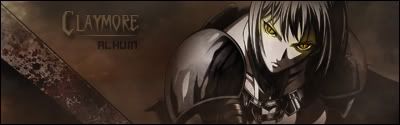
Havn't touched a anime picture in some months.
In tribute to one of the koolest heroine characters ever.
My current set.


Nicely done Kage, nice to see another member branching out of just anime signatures.
I like.
Havn't touched a anime picture in some months.
In tribute to one of the koolest heroine characters ever.
My current set.


I've only watched the first episode of Casshern SINS, but somehow I immediately knew that's what your set was from. The art style is what gives it away. Not really liking the bg on the sides... the right side of it just seems to stop at a horizontal line... the left side flows much better. Love the render though, and your ava is great.
Kage, long time no see... great sig, the effects are amazing. I don't really care much for rap, so I can't really comment on the render. But keep it up.
I need to get back to Photoshop myself... I had to get a new hard drive since my old one crashed, and I haven't found a valid torrent of CS3 yet. I might just have to break down and reinstall CS2. Are there any major differences between them?
It's dangerous to go alone. Take Nep.

im thinkin the sig would be better if you made the blur more subtle. Dont lessen it, just regular or guassian blur the motion blur. Woah lots of blur.
bg looks fine, then again anything blurred in the bg usually does... the colors are bleh IMO i'd change em up.
and thanks Al ;D hope you get your photoshop up and running soon so I can see some more of your work. As to your question, idk, im still using CS myself.

Luci, I agree with Kage on the colours. Nice sig overall, but I have an aversion to pastels.
Kage, excellent work. I especially like how well your text fits.
Alhuin, I haven't tried CS3, but I'm guessing that unless you're dissatisfied with CS2, there isn't a pressing need to switch. CS2 is pretty good for being able to do everything that it needs to do for making a sig. The important thing is getting one of them installed and doing some gfx work again
Yeah... I'll probably just go back to CS2 for now. The one copy of CS3 that looked valid that I downloaded ended up being a virus. That was a bad day.
Anyways, when I get it up and running I'll be sure to post some products. Before I had my HDD crash I had a nice Gaara sig in the making, and a v2 of my Claymore sig that I posted on the previous page, plus some other various pieces.
It's dangerous to go alone. Take Nep.

Originally Posted by Lucifus
what render/scans/pictures did you use.. or where did you get them from? I'm looking for some Casshern pictures for a while (for example when he went berserk with this nice "red" comic-style background) but could only find 2 pictures yet (which weren't really usefull).
Or did you make the pictures yourself with screenshots etc?
Well, I finally found a version of CS3 that worked... I think. At least, it hasn't given me any problems yet. Anyways, here's one from me... a v2 of my Claymore sig (that I mentioned earlier).
I feel it's much better than the first, but I'm still iffy about some things. Namely, the text. I never was really good with text.
It's dangerous to go alone. Take Nep.


Looking good !!
The text is the main problem. You can barely read it. Lighten the tone so all the letters are the same shade as the C, if not more, and play around from there.
I see you've used an edgy/rugged font for the words. It's nice, and I like it. Enhance that rugged feel by firstly lightening it to give it more contrast against the darker black, then make the edges a darker border again to make it feel as if the words are etched/carved/sunken into the background like rock. I can see the back's not meant to be a cliff or any sort of "rock", but I feel the effect would look good.
Anyway, there's some suggestion from a noob
Looking forward to your next version!
Last edited by Buffalobiian; Thu, 11-06-2008 at 04:40 AM.
If it's not Isuzu-chan Mii~
How's this? I lightened the text and made it more defining. If it's still too dark, I apologize... on my screen it's clearly visible (as was the last one), but everyone's screen brightness is different, so I can't really judge.
In any case, this will probably be my last revision for awhile. I want to work on some different pieces.
It's dangerous to go alone. Take Nep.
New sig from Kannagi. I tried making it look more serious than my previous sig, but still keep it simple. Comments and criticisms are welcome!
Peace.

Nicely done, loving the celestial feel to it.
I am training in the shadows.
Currently playing: All of your games, probably.

Great work, nice touch.

Granted im horrible at keeping track of time and im too lazy to check the last post i remember seeing.
I havent checked the forums in a long time and there has been maybe ten posts since then in this thread.
Umm... please become active again?
i promise to post a picture of something. Maybe I'll even post a new sig.
I'm official.
I, too, remember when this thread used to be actively active. Kage, PSJ, Foomanchew, a50, and several others.... Hell, I remember when Lucifus first started posting sigs. This thread was the only reason I posted on the forums back then, to be honest.
Anyways, here's a new one from me. I used a lot of different techniques from a lot of different tuts. No idea who the render is of, or what it's from... but I thought it was cool so I decided to use it. I tried to give it a "sunset" feel. Don't know if I succeeded. Like all my other sigs, I'll probably make some revisions before it's final, and I upload it to my deviantART.
Comments appreciated.
It's dangerous to go alone. Take Nep.
I like it. I've always had a preference for sunset themes, and the whole image is smooth but clear.
Peace.
@ Alhuin: Very nice Alhuin, single 1 px border look superb on that one.
My only suggestion would be to bring out some of the color in the center of the render, still desaturated mind you, but it would look magnificent with the sunset lighting and you'd also be able to read your name.Good job.
@ Zinobi: "Umm... please become active again?"
Done from one of the best DevArt thingies I've ever seen.
And of course......
I'll see if I can get some more in later tonight. In fact, think Ryouga's been waiting on a couple requests....
ill think about it ;p
I'm official.
@ Lucifus: I revamped my "sunset" sig and made my name more visible and tried to darken the center of the render some more, like you suggested. I won't post it here, since it's such a small change, but I should have it up on my DA page within the next couple of days if anyone wants to see it.
Anyways, this is my latest.
I tried to go with a different style of border here, since the single, black, 1px border didn't look good enough on it. It's my first time trying a different style border, so it probably still needs some work. I may also need to replace the background (I can see how it would feel bland to some people). But, wanted to get some criticism from others before I made finishing touches.
PS... Great sigs Luc, I especially like the CC one.
PSS... If it's hard to read my name on this one too, I apologize. My screen's brightness is pretty high.
It's dangerous to go alone. Take Nep.
I don't mind your border at all. It's a very light (as oppose to heavy) that suits your atmosphere IMO. The simplicity of the sig is also very refreshing.
Your name is hard to make out on my display, but as long as it looks fine on yours, that's all that matter, right?
If it's not Isuzu-chan Mii~
Hey man, I'll tell it to you straight. I've always tried to pack much new techiniques as I can learn into signatures to refresh the style, the the outcomes always the same.
Nothing beats simplicity. I mean look at Shinta's lastest. Effing beautiful!
Keep it up Alhuin, I like your lastest.
I demand anyone who has some inkling of photoshop, hell even download it if you have to, contribute to this thread! It needs revival!
 Posting Permissions

 Reply With Quote