I browsed PB for about 20 minutes and wasn't able to find an option to disable/set optimization... is it something you choose when you upload a picture?


I browsed PB for about 20 minutes and wasn't able to find an option to disable/set optimization... is it something you choose when you upload a picture?
It's dangerous to go alone. Take Nep.


The current sig does look weighted to the side, but I still prefer it over the first one since the text doesn't walk all over it.
If it's not Isuzu-chan Mii~
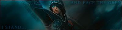
Version 3:
Yes? No? Still feel weighted? Too much distraction from the focal point? I moved my "name" to try and balance the text, but it looks tacky, so not sure what I'm going to do about that.
It's dangerous to go alone. Take Nep.
It still looks like he's making a dunk
If you're set on using that pose i would center him and split the text in 2 parts
It might be my monitor, since V3 looks way too dark.
If it's not Isuzu-chan Mii~

text is way better in your latest one. well most of it, not the text next to him.
Now that you say it like that, I can totally see where it would look like that that. But I don't think the majority of people will see it that way (I could be wrong). And I'm not sure what you mean about splitting the text into two parts, since it kind of already is.Originally Posted by Archangel

It's probably not your monitor, but I honestly didn't make the sig darker. I actually, slightly, lightened the focal area, but I lowered the opacity on the text so as not to draw too much attention to it. The only other thing I did was darken a bit in the area between his arm and head, because it felt to bright for the rest of the sig.
I'm glad (most of) the text looks better, however I felt the text flowing around his body would be a great addition. Why do you not like it?
All in all though, I think I'm taking a break from it for now. I've been reading up on some tuts for different styles and I'm working on a lot of different things right now. I probably won't even finish half the ones I've started.
...I figured my posting here would inspire some other PS users to start working on things; try and revive this thread. Kage, where's all your work been? Used to pump out sigs left and right back in the day.
It's dangerous to go alone. Take Nep.
Check my out, i got some new threads yo
Current set, thoughts?
I like them both. Shichika is very out of character in that sig though.
Criticisms:
I believe the strikingly difference in art style between the sig and the avatar makes for a feel best described as "confusing", though I like them both separately.
And the background for the avatar seems too complex IMO. That in itself isn't much of a problem if you can find a way to make the two characters stand out more.
Last edited by Buffalobiian; Sat, 04-03-2010 at 02:54 AM.
If it's not Isuzu-chan Mii~
Nothing i can do about that, there are too few katanagatari fanarts out there
I don't necessarily agree with you on that point, I'd like to hear some more opinions
Edit: A few alternatives:

Last edited by Archangel; Sat, 04-03-2010 at 10:58 AM.
Personally, I don't think any sig or avatar is complete without a border. When I first started in PS, I made some sigs without a border, and the pros around here (at the time) said it made a sig look tacky and, well, unfinished. So I've grown up on the mentality. It's nothing against your set or your style, just my personal view.
With that being said, I really like the avatar. I'm a fan of images that have the (focal) character looking off into the distance (or at least, not straight at you) but still being able to see their face (or most of it), so that image hits home with me. Like Bill said, the background seems a bit complex. I would suggest creating a new layer above everything, going to image > apply image (keeping settings as they are) then get out the smudge tool (or going to filter > lignify, or filter > distort > wave) and basically mess that layer up. Then get a soft brush eraser and erase everything over the focal. Something like that might bring it out a bit more.
I'm not a really a fan of the alternatives, though I haven't seen the series, so I can't say how well they "fit" their personas.
For the sig, I like it as well, but it feels washed out. I'm not very good with image enhancement, but mostly what I always do is copy the render layer and gaussian blur at 10 pixels, then set to hard light and lower the opacity some to get rid of most of the glow. It works great for darker images, but lighter ones tend to just get even brighter.
You probably already know most of those techniques, just posting them just in case.
It's dangerous to go alone. Take Nep.


Arc, what a cool sig and avatar. Maybe its time for me to make a new one.
Thanks shinta|hikari for the sig.
Thanks
You shouldn't force it, just wait for an anime you'll love as much or more as you did Saki
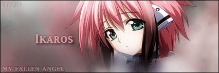
Trying out some tuts and different styles. I'm not really liking a lot of the results, and I still haven't found a good tut on working with the pen tool, but here is an unfinished work that I thought was pretty decent.
The background is basically a smudge background; there was no brushing in this. I know it gives off a really simplistic feel, but like I said, it's unfinished, and might even be scrapped. But aside from the empty space (and the horribad text), I just wanted some comments on the feel of this.
It's dangerous to go alone. Take Nep.
WHAT? No way?! I like this
Sure it's unfinished, but I love the dreamy feel, and that render's good.
I'm not sure how well this will turn out, but it came into my mind, so I might as well spill it out. How would that sig look with the render put to the right? How would it look with the render still centered, but made smaller?
I'm trying to rationalise the "slightly off" feeling I'm getting from it, and it may be because having such a large, closeup pic smack center stops it from "blending in" as well as it could have.
If it's not Isuzu-chan Mii~
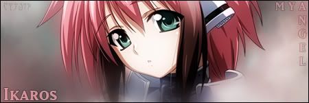
Version 2:
Again, ignore the horribad text, I was just trying to fill empty space at the moment (I actually am not sure what to do with text on this one).
Anyways, I took both your suggestions. I made the render smaller and moved it more to the right. How are you liking it now?
EDIT: Also, I don't think I could really scrap this. Ikaros is just too cute.
It's dangerous to go alone. Take Nep.

I believe the 'slighty off' feeling your getting is due to the smudged render on the left.
Excellent and simple, but I think you should bring the render to the forefront without smudging the hair. It would stand out and contrast perfectly, and maybe add a slight lightsource behind the render.
My 2 cents.
Last edited by Lucifus; Tue, 04-06-2010 at 11:54 AM.
The tutorial(s) I was pulling from had all the renders obscured slightly by a smudged/brushed foreground, as opposed to having the render fully visible. The idea was to "blend" most everything in except the focal point. I can try erasing part of the smudging on the left side of the render and see if that helps any.
It's dangerous to go alone. Take Nep.
Does that tutorial have any good examples that you could post so we can see how good its effect could potentially be?
I can't really say if V2 is better or not. I can't even put my finger on what it is now. After reading Lucifus' lightsource idea, I'm curious to see how that would turn out too. It might even make the "wasted space" more interesting.
If it's not Isuzu-chan Mii~
Well, the smudging tutorial is this one. Obviously, that has C4D renders and various other tasks that I wasn't interested in at the moment, but the basic idea is what I took from it. As for the other tutorial with smudged/brushed/erased parts of the render... it was actually one Lucifus posted on one of the Tutorial thread pages... but it seems to have been taken down, so I can't point it out. Pretty much every tutorial I've read over on Animerender has the render being obscured by something in some way. In fact, when I posted my Lily Saber ver. 2 sig over there, it was criticized as being too plain and simple, and that the render sticks out too much. So I'm just going by what looks good to me at the moment, and think it looks better partly smudged over. I'll try messing around with it at some point though, since, like I said, it wasn't meant to be a final sig, just the idea I was playing around with and wanted some feedback.
I am working on another sig featuring the same style though... maybe it will turn out a bit better.
I need some more work with text though...
It's dangerous to go alone. Take Nep.
 Posting Permissions


 Reply With Quote