Page 227 of 337 FirstFirst ... 127177217223224225226227228229230231237277327 ... LastLast
Results 4,521 to 4,540 of 6729

Thread: New sig or wallpaper? show it off here!

  1. #4521
    Lasers? Cookies? FTW!
    (universally beloved
    moderator ex-emerita)
    KitKat's Avatar
    Join Date
    Aug 2004
    Location
    Vancouver, BC
    Age
    41
    Posts
    1,649
    I remember you too, Fox Fire! Nice to see you back!

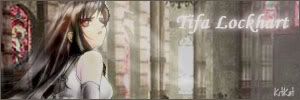
    So, I've finally opened my Photoshop again for the first time in...well, a very long time. I did a remake of my Tifa sig that was formerly purple butterflies. Comments?


    Edit: Changed up text \/ \/
    And I know, this is my old ava from the purple butterfly version of the sig....I'll change it to something that matches better soon.
    Last edited by KitKat; Mon, 07-31-2006 at 01:01 PM.

  2. #4522
    Quote Originally Posted by xDarkMaster
    Thanks for the comments everyone, but does that mean I should work on the Saber one?
    nope. just look at the differences between the good one and the bad one and see what you wanna use in the next sig you make.

    KitKat, the sig is nice but the text is pretty bad.

  3. #4523
    Heh, that's deep and insightful...or something...

    The thing is I made them with the same method. >_>

  4. #4524
    Lasers? Cookies? FTW!
    (universally beloved
    moderator ex-emerita)
    KitKat's Avatar
    Join Date
    Aug 2004
    Location
    Vancouver, BC
    Age
    41
    Posts
    1,649
    Kage, I know
    Text is the bane of my existence.

  5. #4525
    Fails at reputation Mizuchi's Avatar
    Join Date
    Jan 2006
    Location
    Lior
    Posts
    426
    Wallpaper: http://img243.imageshack.us/my.php?i...llpaperfz4.jpg

    I borrowed the picture from somewhere else, and then used filters to make it look nicer.

    Sigs:


    All are sigs to my previous aliases (except the last 2, i just did those for fun). I also made these about a year ago, haven't really touched photoshop since. Just felt like posting these.


    Any rates/comments?

  6. #4526
    wp is pretty cool though yea you didnt do too much

  7. #4527
    Yeah...another one.


    This one ended up bright and kind of having a relaxed feel unlike most of my other sigs.
    Last edited by xDarkMaster; Thu, 08-03-2006 at 10:01 AM.

  8. #4528
    Junior Sexfiend PSJ's Avatar
    Join Date
    Jul 2003
    Location
    At a bar
    Age
    35
    Posts
    5,104
    I like the bg even though it is pretty flat. That style is nice, would you mind doing a tut for it? I Think i should start up the ol ps again now that work finishes and shit.

  9. #4529
    Thanks for the comments PSJ! Yeah, the BG is flat but I didn't want it to be too sharp and bold.

    As for the tutorial, this sig was mostly trial and error. >_> I still remember most of what I did but not every little detail. I know I threw in some filters and adjustments that I don't remember. I'll go back and if it seems like I remember enough of it to make a decent tutorial (it would be my first!), I will see what I can do.

  10. #4530
    just make a whole new sig with that style and then make a tut for it at the same time

  11. #4531
    Remnant of Woot Lucifus's Avatar
    Join Date
    Sep 2005
    Location
    Photoshop, Eclipse, Notepad
    Age
    33
    Posts
    1,949
    Well.....on the count that i'm too lazy to do a sig and I can't seem to make a decent one latly(artists block =P) I just resized this.

    http://img361.imageshack.us/img361/6526/karuravr4.jpg
    http://img362.imageshack.us/img362/7771/karuralb5.jpg
    Don't believe in yourself, believe in me, who believes in you.


  12. #4532
    Moderator Emeritus masamuneehs's Avatar
    Join Date
    May 2005
    Location
    a fountain pourin' like an avalanche, comin' down the mountain
    Age
    38
    Posts
    3,874
    Quote Originally Posted by Lucifus
    Well.....on the count that i'm too lazy to do a sig and I can't seem to make a decent one latly(artists block =P) I just resized this.

    http://img361.imageshack.us/img361/6526/karuravr4.jpg
    http://img362.imageshack.us/img362/7771/karuralb5.jpg
    *starts cutting render*

    wait for it...

    -in render section.
    tried as best I could on it.

    Man that's one beautiful picture. Wish it had all of her body in it though, the render felt that much less complete...

    hope someone uses it in a sig, specially since i've not been doing any myself recently.
    Last edited by masamuneehs; Thu, 08-03-2006 at 01:12 AM.

    Humans are different from animals. We must die for a reason. Now is the time for us to regulate ourselves and reclaim our dignity. The one who holds endless potential and displays his strength and kindness to the world. Only mankind has God, a power that allows us to go above and beyond what we are now, a God that we call "possibility".

  13. #4533
    Remnant of Woot Lucifus's Avatar
    Join Date
    Sep 2005
    Location
    Photoshop, Eclipse, Notepad
    Age
    33
    Posts
    1,949
    Nice Masa, I was gonna really make a sig of it, but After 5 attempts at rendering it, I gave up. But man, the pic is beautiful.....
    Don't believe in yourself, believe in me, who believes in you.


  14. #4534
    Saw it and couldn't resist.


    @Lucifus: Awesome picture. The sig looks a little too stretched to me though.

  15. #4535
    Lasers? Cookies? FTW!
    (universally beloved
    moderator ex-emerita)
    KitKat's Avatar
    Join Date
    Aug 2004
    Location
    Vancouver, BC
    Age
    41
    Posts
    1,649
    Lucifus, always try to avoid changing the aspect ratio of any picture you're working with. The distortion makes it look unnatural. Really nice picture though. It lends itself to sigs very well.

    xDM: Whoa, that's totally creepy (I hope that was the effect you were going for...)! Well done.

    New one from me. I've been trying to catch up on Bleach lately, although I'm still pretty behind.


  16. #4536
    Remnant of Woot Lucifus's Avatar
    Join Date
    Sep 2005
    Location
    Photoshop, Eclipse, Notepad
    Age
    33
    Posts
    1,949
    @ xDM- Nice sig, seriously.

    @KK- Haha, even the text fits. I like it! Everyones been moving on from the HQ render blended in with the brushed background but that sig ownz nonetheless.
    Don't believe in yourself, believe in me, who believes in you.


  17. #4537
    Thanks for the comments!

    KK: That is one totally awesome sig. As Lucifus said, the text fits (which I have yet to accomplish >_>)! Good BG, blends well, nothing I would say to fix.

  18. #4538
    Nicely done, KitKat! The brushing is pretty cool, and Kon fits right in with it.

    Here's a new one from me:

  19. #4539
    Quote Originally Posted by KitKat
    New one from me. I've been trying to catch up on Bleach lately, although I'm still pretty behind.

    ROFL awesome! could use some big "KON" text

  20. #4540
    ANBU Captain Zinobi's Avatar
    Join Date
    Apr 2005
    Location
    wait...what?
    Age
    32
    Posts
    701
    nice GLS looks good
    hmm...already gave my two cents to KK on IRC...
    @xDM sweetness thats awesome

    I'm official.

Posting Permissions

  • You may not post new threads
  • You may not post replies
  • You may not post attachments
  • You may not edit your posts
  •