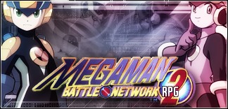
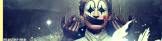
Hey Kage~
Created as an advertisement for a friend. It's actually a pretty awesome rpg game.


Hey Kage~
Created as an advertisement for a friend. It's actually a pretty awesome rpg game.
master_me + dA = <3


whoa they some cool siggys Oo'' so much better then me


take off the color balance or whatever you have making the chick on the right more pinkishOriginally Posted by master_me
and it could use a boost of contrast, but not too much.
I really like this Sai render, if you can't tell already.
Also, I made another version. So, which do you guys like better?
v2:

Last edited by Seraph; Tue, 09-19-2006 at 05:09 PM.


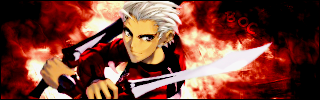
The diagonal "line" made by Sasuke's face and the background is VERY awkward. Smooth it out.
Version 2 is better.
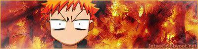
Huh? Sasuke?
Not Sasuke? Whatever. The dude's face.

Actually, this brings up a good point. I could have sworn there was a rule against spoilers in sigs, but I can't find it in the rules threads. Maybe it's an old rule.
I think the Sig you just made is fine, but make sure never to include any important info about that character. Don't show him beating any opponents or revealing any secrets. I only mention it because I see you use that character as an avatar on your role-play site. It's just something to keep in mind in the future.
A sig like the one you just made is fine, I'm sure. I remember that there were a number of sigs featuring Itachi and Jiraiya (without any important info or their names) before they premiered in the anime.
Ask a mod if you're ever unsure how much info you can put in your sig; They're much smarter than I am.
Last edited by samsonlonghair; Wed, 09-20-2006 at 04:00 AM.
"Samsonlonghair - The Defender of the Oppressed And Shunned!" -Kraco

It's in the "The Almighty Rules of Gotwoot" thread near the bottom.Additional rules for Anime Fanart forum:
1. No use or posting of images that contain spoilers: If the anime has not shown it, please do not use it in your artwork. If you are sharing a piece that includes spoilers, please link it, and warn the members. This rule applies to avatars, signatures, wallpapers, or any other fanart.

Just something I whipped up for a friend.

Good stuff. Try making the logo grayscale?
Alright, did some minor changes.
v1
v2
Possible character spoiler:
http://img169.imageshack.us/img169/9...aphcopypy4.png
It "ends" too abruptly on the right side. Smooth out the transition. The left side is nice because it's an uneven (natural) transition whereas the right side kinda looks like it stops on a vertical line.
New relatively "not too complex" sig.
Updated. I like the 320x100 dimension better.
Last edited by Board of Command; Fri, 09-22-2006 at 09:24 PM.
nice, and BOC is right...I'd just duplicate some of that design, move it over, and lower the opacity so it looks like its fading away.

<=-- new avatar. :O

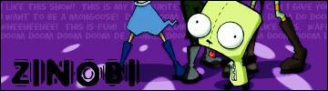
Zinobi and I were talking last week about how much we love Gir from Invader Zim, so we had a sig swap. I tried a syle I hadn't used before for his sig. It feels weird to make a sig without brushing. I should vary my styles more often.
Captain America.
Salamander.
http://img153.imageshack.us/img153/9...aphcopyzd2.png
Same render as the last two times, so careful for character spoilers.
Pretty decent stuff. The first one is pretty nice and I don't have anything to add from a technical standpoint. The second one looks a bit flat but that might be your intent.
 Posting Permissions

 Reply With Quote