Very nice. That's a very uncommon style of border, but I like it.


Very nice. That's a very uncommon style of border, but I like it.

Nice looking sig.Originally Posted by Wave

Hot, Wave. Very hot.
I agree with BoC; it works, though, and rather well at that.
Recent. It's up there with my coke sig as far as favorites go.
A few days ago, I made this and never posted it anywhere. I just took another look at it two seconds ago, and I realized it wasn't a bad start. I reworked the rendering and colors, and then put a lot of focus and a lens flare (as well as some pink brushing set to soft light/overlay) on the arm.
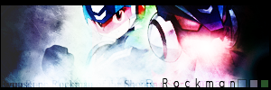
master_me + dA = <3
Left side fades to black too abruptly. (on 2nd one)
You should've seen it before.
Looking at it again, I've decided I hate it. I have to stop doing art after midnight, I always pull a hippie and think it's awesome.
master_me + dA = <3


I'm going back to it tonight, possibly to fix up the brushing at the far left and right. I should also add a "DF" some where in there to make it not as stealible (I'm aware thats not a word)
I have not ask for my comments of late, so is there any other suggestions?
image fail!


500 hours in MSPaint. Image not drawn by me.
My first graphical sig since GW survivor, actually.
<@Terra> he told me this, "man actually meeting terra is so fucking big", and he started crying. Then he bought me hot dogs
The hilt(?) on the left makes the whole thing a bit awkward. Try to get rid of that using clone stamp or something. Also, add more dark areas on the sides so there's more focus on the render. Text could be omitted.
...and I think that's all I can say right now.

Test test test Hohohoh. My new Siggy is complete.
I'm too lazy to do a nice one. Black and White will do!
MmmMmm. Ooiiishiii


Both of them are really good, but I personally prefer the first one. I find the second one with the head in the background cool but weird at the same time...
Fixed:
Added:

image fail!

Whoa....its been quite a while....
Great job on the new sig Deadfire. The bg flows great into the render. It has a really crisp style to it.
I'm glad to see that alot of people's PS skills have gone up considerably. I've been really busy with school and work recently, and both my posting and PS work has suffered. I'm gonna try to post more, as well as get some work up again, but I'm really happy to see people getting into Photoshop and Graphics still.
For all you awesome people, it's just Phoenix. The numbers are just the amount of times people misspell it.

A new signature I made recently :
Version 1
Version 2

Nice work, KoKo. What's that brown thing at the bottom to the right? Maybe you can remove that...
It was part of the original render itself, but I removed most of the red line.

Last edited by KoKo37; Mon, 11-06-2006 at 04:49 PM.
Not to be blatantly advertising or anything, but I made a few advertisement banners for my site and I think they turned out pretty well, which is why I'm posting them. I'm saying that just to be clear, so that no one minus-reps me or flames me. There are six total, though they're all based on the same c4d render, so I'll stick to posting the two subvariants.

master_me + dA = <3
Koko i think the middle looks the best out of my opionion, but it's not my choice ^_^ i give all together a 8/10 XD

Check out my new superfly sig.
CuTzor yourselz!
Now 99% disease free!
 Posting Permissions


 Reply With Quote