Page 284 of 337 FirstFirst ... 184234274280281282283284285286287288294334 ... LastLast
Results 5,661 to 5,680 of 6729

Thread: New sig or wallpaper? show it off here!

  1. #5661
    It wasn't much Archangel's Avatar
    Join Date
    Feb 2008
    Location
    Portugal
    Age
    34
    Posts
    10,833
    Blog Entries
    3
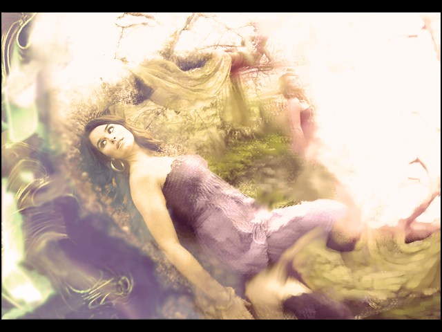
    Not bad, but not some of your best work either Lucifus

    There is too much attention being drawn into the background and not enough into lovely Saber and lovelier Rin.

    Also, in the second one, it looks like you just threw the text in there without much consideration for its location.

    FYI, it pisses me off that your "quickies" are better than any sig i'll ever hope to make -_-

  2. #5662
    new LP... left side is what i spent the most time on. its a culmination of c4d filters and smudging.

    what could be better?


  3. #5663
    Procacious Polymath Ryllharu's Avatar
    Join Date
    Mar 2004
    Location
    American Empire
    Age
    39
    Posts
    9,849
    The transition of the smudge and blur effects into the center of the image is kind of abrupt. It works well coming in from the upper right of her (where the image is a little more textured and complex), but it looks a little awkward on smoother surfaces like her skin.

  4. #5664
    Awesome user with default custom title KrayZ33's Avatar
    Join Date
    Aug 2007
    Age
    35
    Posts
    4,262
    I've never done a signature before, so this is probably not very good.. nonetheless, I'm proud of it

    I somehow managed that the background looks like a broken wall... I wasn't satisfied with the background I made at first, because the right site looked like the left (which is now the wall).. it was so "empty"

    If I only could remove the spiral-lines now :/


    (a bit more contrast)


    what do you think?

    it was a lot of fun to make it, I don't have Photoshop but "Gimp" is really good too. I think I'll try to do more at some time.
    Last edited by KrayZ33; Mon, 01-26-2009 at 05:50 PM.

  5. #5665
    It wasn't much Archangel's Avatar
    Join Date
    Feb 2008
    Location
    Portugal
    Age
    34
    Posts
    10,833
    Blog Entries
    3
    Awesome for a first try dude, you seem to have a knack for render placement.

    But you should really get photoshop, it's just a more fun piece of software to use.

  6. #5666
    If I could change my name
    to Saberfire... I would
    Deadfire's Avatar
    Join Date
    Sep 2005
    Location
    Canada
    Posts
    1,263
    Not much new from me

    image fail!

  7. #5667
    idk if its from looking at sigs everyday for a while and posting my thoughts on them but a couple things come to mind I think might be of some use to you my friend....

    things I dont like; the text... too much contrast... colors are blehhh, seems liek you used too much yellow and red saturation... needs a "focal point" or something to focus the attention to, doesn't necessarily have to be a render or something like that. Could create it by utilizing negative space, which you dont have much of. As for the bg, could be worse, but its kinda cluttered and doesnt have any 'flow' to it, or its all moving around in different directions making it seem chaotic and not too appealing on the eyes.

    things I do like; the border. lol :P

    Hope I could help

  8. #5668
    Haven't made a sig in a while... Been playing this VN recently...

    Thus, I give you:


    Nothing special.

  9. #5669
    It wasn't much Archangel's Avatar
    Join Date
    Feb 2008
    Location
    Portugal
    Age
    34
    Posts
    10,833
    Blog Entries
    3
    I still prefer your current sig

  10. #5670
    Remnant of Woot Lucifus's Avatar
    Join Date
    Sep 2005
    Location
    Photoshop, Eclipse, Notepad
    Age
    33
    Posts
    1,949
    I personally think thats a pretty sick job you've done there iTT. The text is superb, and the bar not too intrusive. Your vocal point is as clear as can be and the lighting combined with the scanlines make for a picture perfect effect.

    SAYA NO UTA is also right where it needs to be. Damn nice job mate.
    Don't believe in yourself, believe in me, who believes in you.


  11. #5671
    Wild Card Fool RyougaZell's Avatar
    Join Date
    Aug 2004
    Location
    Mayonaka TV
    Age
    43
    Posts
    5,593
    Nothing special... just the first signature I've done myself.


  12. #5672
    Family Friendly Mascot Buffalobiian's Avatar
    Join Date
    Sep 2006
    Location
    Amaburi
    Age
    34
    Posts
    18,610
    I love the pose dude. If anything, you could change the background colour to increase the contrast of the text, since -Koto (the kanji) loses a bit there. Otherwise, nice!

    If it's not Isuzu-chan Mii~

  13. #5673
    Pit Lord shinta|hikari's Avatar
    Join Date
    Jan 2006
    Location
    The Pits
    Age
    37
    Posts
    10,450
    Blog Entries
    1
    The text in that sig seems really choppy, with the pixels showing. I would also suggest making the font smaller, so as not to make the sig look all cluttered.

    Here are two new Kara no Kyoukai sigs.


    <img src=https://ibb.co/1dDDk6w border=0 alt= />
    Peace.

  14. #5674
    Remnant of Woot Lucifus's Avatar
    Join Date
    Sep 2005
    Location
    Photoshop, Eclipse, Notepad
    Age
    33
    Posts
    1,949
    I...want that render Shinta. I think you know the one.

    In your first, though I know its what you were heading for, I'd darken the text abit and the border as well.

    Mr. Zell, love the pose, but I agree with Bill. The text is holding it back just a little. I would also add a more substantial border if one already exists, because I cant see it at the moment.
    Don't believe in yourself, believe in me, who believes in you.


  15. #5675
    Wild Card Fool RyougaZell's Avatar
    Join Date
    Aug 2004
    Location
    Mayonaka TV
    Age
    43
    Posts
    5,593
    Understood. I'll see what I can do with the text. I kinda stole it from the official site, so yeah... it needs cleaning. I'll work on it tomorrow.

    Thanks everyone.

  16. #5676
    Pit Lord shinta|hikari's Avatar
    Join Date
    Jan 2006
    Location
    The Pits
    Age
    37
    Posts
    10,450
    Blog Entries
    1
    Edited the Touko one. Added a bit more contrast, as suggested.

    <img src=https://ibb.co/1dDDk6w border=0 alt= />
    Peace.

  17. #5677
    It wasn't much Archangel's Avatar
    Join Date
    Feb 2008
    Location
    Portugal
    Age
    34
    Posts
    10,833
    Blog Entries
    3
    Quote Originally Posted by RyougaZell
    Nothing special... just the first signature I've done myself.

    Wtf?? O_o

    I kept looking for Misaka renders and i couldn't find anything, so where the hell did u get that?

  18. #5678
    Toaru Majutsu no Index-tan episodes. Should check it out since it's hilarious.
    I am training in the shadows.
    Currently playing: All of your games, probably.

  19. #5679
    Quote Originally Posted by shinta|hikari
    Edited the Touko one. Added a bit more contrast, as suggested.

    really like this one.

    few ideas..... different text for your name, and some more orange/red in the foreground around the girl.

  20. #5680
    Wild Card Fool RyougaZell's Avatar
    Join Date
    Aug 2004
    Location
    Mayonaka TV
    Age
    43
    Posts
    5,593
    Despite Archangel doing a better one... I wanted to fix mine. Here is the result after the suggestions. Not the greatest thing... but since its my first Im kinda happy how it ended.


Posting Permissions

  • You may not post new threads
  • You may not post replies
  • You may not post attachments
  • You may not edit your posts
  •