Is that a good thing or a bad thing? What do you suggest?Originally Posted by Nadouku

Is that a good thing or a bad thing? What do you suggest?
Peace.


It's a good thing! The red shows her passion and that's pretty neat. I don't see anything else that needs adding, or in my opinion, at least.
I am training in the shadows.
Currently playing: All of your games, probably.


I think they look awesome. Nice sig and avatar.

In that case, I'll throw my thoughts out there.
Would it be better to create some contrast and separate Mio from the background in your sig there?Her flesh is distinct alright, while her hair sort of blends in to her surroundings. Not sure if that was the effect you're looking for.
If it's not Isuzu-chan Mii~
I was actually going for that. I kind of like it when the render fades into the BG. I am now at my work PC and I am actually surprised that it still has that much definition (her hair I mean). Must be display issues I guess. Thanks for the comments.
EDIT:
New sig. Mio once again.
Really simple this time.
Also, I made a new avatar. The last one didn't match the sig.
EDIT2:
I made another version of my current. The lightness of the skin kind of bugged me, so I made one with a different tone, and a bit darker with more contrast. Which do you guys think is better?

Last edited by shinta|hikari; Fri, 04-17-2009 at 12:45 PM.
Peace.


I like the new one better. *thumbs up*
MioSig 1v2 is better, and looks more natural. It still maintains the contrast with the darker colours, but isn't as jarring and more pleasing to the eye.
MioSig 2 is good too. It's different to 1v2, so I really can't choose which one I like better.
And the new avatar is sickI'd say stick with 1v2, since it's better than 1, and matches the avatar more than the black/white sig, since they've both got a brown and messy background.
Last edited by Buffalobiian; Fri, 04-17-2009 at 09:12 PM.
If it's not Isuzu-chan Mii~
Thanks for the comments! Makes going through the trouble of making a sig worth it
Peace.


liking the sigs hikari, keep em coming.
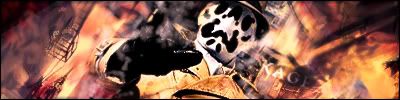
heres a new one from me
-
You seem to be going on a flame theme lately. Looks cool, even if I don't know the character in the sig.
New sig and avatar set (my current).
As always, comments please.
Peace.
I like that signature, Kagemane_no_Jutsu. It gives a weird vibe of mystery and vast destruction about it. Your name seems hard to read, but other than that, it's very cool.
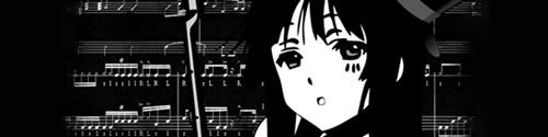
As for shinta|hikari's new set, it's a pleasure to look at your works. Your new avatar reminds me of how an embarassed Mio looks cute in her own way, and your new signature is good, but I liked your old one better because it had more striking contrast about it. This new one only shows so much of different colors and I think it's a little bland, in my opinion. Otherwise, it's good.
I am training in the shadows.
Currently playing: All of your games, probably.
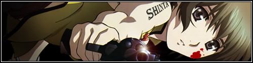
New sig.
Ein from Phantom.
Comments please!
Peace.
@Kage: looks pretty nice, though I don't know that character neither. Looks like a dude I saw from the Watchmen trailer I think. Still, I like your Naruto one better
@shinta: In terms of contrast, this one is much more contrasting than the other, in both colour shades, and the differentiation between the background. As for being "bland", in my opinion, it's because this one's more simpler in design, in both colour and "foreground slapped on background" feel, due to the 2D background. The previous one (Mio1v2) had more depth, due to its richer colour choice, as well as the more complex and layered background (well, it looks like it has multiple layers anyway). This new one (Mio 3v1) looks good too, much better than Mio 2v1. I think having some colour brings life into the sig, yet keeping the simple black&white feel.
The avatar is more "generic", for lack of a better term, but that doesn't mean it's bad. As Nado said, this one really captures the embarrassed Mio, as well as her cuteness. The white background lighting makes this much more suited to your current sig than MioAvatar 1v1.
This new set, in short, feels more "light".
Ein feels a bit off. I think I'd prefer if her face lacked a bit more expression, especially by toning down the sheen in her eyes, and perhaps the mouth expression? Her body taking up the majority of the sig doesn't quite feel right neither. Maybe she's just overshadowed by the Mio sigs
(Now I want photoshop)
Last edited by Buffalobiian; Sat, 04-25-2009 at 08:58 AM.
If it's not Isuzu-chan Mii~
New sig (my current). I was going for the line-up look in this one, simply because it fit the render so well.
Comments please!
Peace.
Haha i like it, it's both original and funny
All i'd change would be the background. I'd add some more length to the height lines so you could see just a bit more of the final render
You've got a good sense of humour shinta
If it's not Isuzu-chan Mii~

Forgive my ignorance, who is the last character (from left to right)?
It looks like Mana from White Album, but I'm sure it is not.
Hmm... like Ryllharu, I've never seen that character before. Perhaps, a character that has yet been introduced? Nonetheless, it's a funny signature.
I am training in the shadows.
Currently playing: All of your games, probably.
I actually don't know either. It was part of the render, and instead of zooming in more to remove her from the sig (which would consequently remove boobage), I opted to leave her in.
Thanks for the comments!
Peace.
thanks for all the good vibes
your new sigs pretty serious nadoku but i think the contrast is turned up too much
shintaaa thats some funny shit... nicely done too.
 Posting Permissions


 Reply With Quote