I think it has too much black space, try filling that out
I'd also go for brighter colors but that's just my personal taste

I think it has too much black space, try filling that out
I'd also go for brighter colors but that's just my personal taste


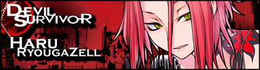
I pretty much haven't had the time to better my low skills on Photoshop... but I had the sudden urge to do this one.
Its nothing original though... I blatantly copied the Yuzu one and replaced her with Haru...
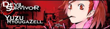


I like the yuzu one much more, maybe because I like her looks better :/
and she has this extremely cool look on her face
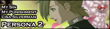
I had the sudden urge to make this one.
The image doesn't have that great quality since its a 1998 game and hunting a good scan became a total pain.
Lisa Silverman. Persona 2.
Thoughts?
Your stuff reminds me of the stuff i made when i first got photoshop. It's actually kind of nostalgic to see it haha
I think Luci made a tutorial on render improvement that would probably work well with the one. Also, try to extract it a little better
Linkage would be appreciated.
And the render extraction was the best I could do... the video was a youtube source -___-
Use the Poly lasso tool and zoom to like 400%
Takes some time but it's worth it
Try this, but you might want to use a different background for it


One of my favorite characters to use in Super Smash Brothers Brawl is Jigglypuff, so after much delaying, I have finally created a signature as a tribute to it.
Tutorial Used: http://10steps.sg/photoshop/creating...lor-wallpaper/
The text is off a lot, so I will have to fix that very soon.
Lol, i had to look for a couple seconds to see it
The "legs" in the center divert your attention from it


It took me a little longer than a few seconds, but I found it.Originally Posted by Archangel
I was like...."Where's the Jigglypuff?"
If it's not Isuzu-chan Mii~
New CANAAN sig. It is my current as usual.
Comments are welcome
Peace.

Cool as usual. I was like "where do the scanlines go: vertical or horizontal?" at first glance, but now I know the answer.
I am training in the shadows.
Currently playing: All of your games, probably.
The source was from the CANAAN OP1 CD art, right?
I really like the colour scheme, since it blends with her hair so well.
Nice job.
If it's not Isuzu-chan Mii~

I made this sig three years ago when I was going through a phase of only b&w signatures, but I never used it. Today I was looking through some old files on an external drive, and I'm thinking of using this here.

"Samsonlonghair - The Defender of the Oppressed And Shunned!" -Kraco

i like it, text on the left is pro... right text ruins it.
This
If you don't have the psd you could try some gradient overlay and then some healing

The source image I got this from had a very yellowed, aged vellum feel to it that I liked, so I tried to maintain that. Unfortunately, the smoke really doesn't work with the yellow at signature resolutions, where it all but completely disappears, but I suppose it could make a decent PSP wallpaper with a few minor adjustments.
(That is..if I had a PSP).

You can simply up the contrast to make the smoke stand out more. A bit of colour balancing and adding an orange tint can make it a great sig.
Peace.
Sorry for the double post.
New sig and avatar set. Again, it is my current.
Please ignore the strange blank space to the left of the left scan lines (the scan lines are supposed to extend to the edge, like the right side). It is unintentional and will be edited out after I get back home from work.
Comments please!
I just had to make them after watching Rebuild of Evangelion 2: You Can (Not) Advance. Fantastic movie, but no decent copy out yet.
Peace.
I like the avatar, but the render in the sig looks a bit too much like cheesy SquareEnix CG. Personal taste due to my deep hatred of the horrible dub on Star Ocean 4, which Asuka with plug suit reminds me of. Aside from that, the sig is nicely done too.
Now I have to get back on fixing that thing with your advice.
 Posting Permissions


 Reply With Quote