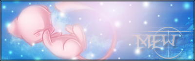
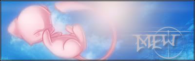
I considered using it for the 2nd one, but decided to use the one for my current instead because of the colouring style. I wanted it to have a soft look more reminiscent of the manga instead of the crisp version in the anime.
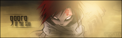
@Buff - I edited her cheeks. Does it look better this time?
EDIT: I also updated the avatar colours to match the sig a bit more.


 Reply With Quote