No, to me the render seems fine. Its just the text. Otherwise, thats great sig.


No, to me the render seems fine. Its just the text. Otherwise, thats great sig.


I agree with xDM: the render looks a little stretched. And the text, of course, needs work. Other than that, it looks nice; I like the render and the background. You know you can get new brushes off DeviantART.
Anyways, God#2.... you've produced quite a few sigs over the months; and, while they are good for beginners (minus the most recent one, which seems like you made it in 5 minutes), I think you should read up on tutorials and start trying different techniques. Start downloading some brushes and begin making more complex sigs. By no means am I demanding you do this, but you'll grow as an artist as you try different techniques.
Anyways, another new one. Kinda simple.... I think I need to work on the text...

v2 of the sig (fixed render size and changed text):
The text probably needs to be fixed again but meh, I think its better than the last one I used. I haven't updated any of my brushes in like a year. Anyone have any recommended brushes I can get off DeviantArt? I'm thinking of deleting everything I have (some of mine are crappy) and starting fresh. The only ones I'll probably hold on to are my tech brushes.
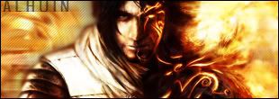
@Al: That PoP sig is kickass! Love the background.
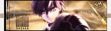
This fantastic Sousuke sig was made by the one and only Lucifus! Thanks man!

Any way to sharpen the render a bit? It's really awkward when the background is sharp and the the render is blurry. Try Unsharp Mask or High Pass.

Here is my latest sig, I think it needs some work. It just doesn't feel right for some reason. Any advice is appreciated.


The text has rough edges, and it could blend a bit better also otherwise with the bg. Parts of Toushirou also look quite pixelated, or overly sharp. However, other than that, I like especially the background a lot. The render is quite nice as well artistically. It could also be worth the try to see if a tiny amount of blue hue would make the render fit better together with the background, unless your original intention was to make it clearly stand out, in which case it's just fine.
Try the Photo Filter adjustment layer, it's a really neat tool. Also, the text color stands out way too much.
Thanks for the help guys. I see what you mean about over sharpening the render, that was fixed. I also tried to make the text and Toushirou stand out less. Here's what I came up with.
@BoC: A neat tool indeed, I'll have to play around with it more. Thanks for the tip.

A LOT better now. Nice work. Now the only little problem is the bright outline on the sleeves, but I'm sure that can be fixed in 5 seconds.

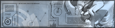
I took the background of something I never quite finished and made it into this. I was sort of messing around with 1px brushes as one can see, so it's sort of messy. But still, I learned a lot from this signature. Like, "sucks lol"
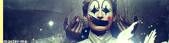
master_me + dA = <3
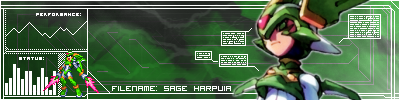
I think one problem is that the background isn't techy enough to go with all those tech brushes.

Well, been away from Gotwoot and sigs for awhile. Since I'm back, figured its time for a change, what do you guys think?
Don't think its too bad, comments?
It looks a lot better. Very good work.Originally Posted by xDarkMaster
I think it's very good. Very brave use of colours, to say the least, but also succesful. Something I certainly could never do... I don't actually have anything really concrete to suggest other than that it might be worth the while to try different hues for the "Nakama" text. I suppose my eyes stronly look for harmony, and since the current colour of the text isn't used elsewhere in the sig, I think it just might look better with some other colour or hue. It might, but you don't know before trying, really.
Quite; I realized that myself. So, I made this earlier this morning:
Last edited by master_me; Sun, 04-30-2006 at 11:07 AM.
master_me + dA = <3
Thanks, I was never really good with text, but I'll give it a shot. =D
EDIT: Also, can any of you guys tell me how to have selected sigs change by them selves?
EDIT 2: Which of the two do you guys prefer?

Last edited by Lucifus; Sun, 04-30-2006 at 01:32 PM.

www.randomimage.net
And I like the first one better. While the blue is sort of out of place so to speak it works well and is a lot easier to read. That sig look awesome too Lucifus, nice way to start back up.
, Thanks man, I also lost all my old sigs, so gotta make some new ones for that random image thing, =)
I think the red looks better, as it doesn't look to be out of place colours wise, but TonTonHater has a point of the old blue being more easily readable. Of course it must be your choice in the end, but if some tweaking could get the red a bit easier to read, I would vote for it. Now I really can't say, because in my eyes the blue still clashes slightly.
Hmm, how about this?

Hmm... A tough question. A kind of liked how the red was almost the same as the fiery red of the hair. Whilst it's now easier to read, that's true, it's also less prominent. The lighter colour pushes the text towards the backgroud, and now the render is at the foreground more. Not counting the ease of reading, that's the difference between these two red shades. I don't know if you desired that.
 Posting Permissions

 Reply With Quote