You were a troll...?
But anyway, I really like the Naruto one.


You were a troll...?
But anyway, I really like the Naruto one.

Hello, what you think of this?
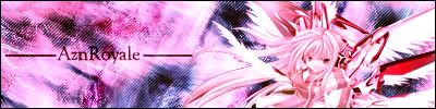
Not really fond of the "line" going down the middle.
(where it suddenly goes from pink to blue/purple)

Aznroyale - In my opinion, you've turned out a mighty fine piece of work. Though it well....confuses me a little? Excellently done.
PSJ- As usual, off the hook. Damned fine editing.

Worst sig ever. ¬_¬
v4, about sixty layers now. All defaults used, so not even any c4ds for the first time ever.
master_me + dA = <3


Good to see you guys are still making sigs. It's been awhile for me, but I saw this pic and couldn't resist.


nice xDM but you could better on the text man. Everything else looks fine.
This is also the most action I think ive seen this thread have in monthes. Great to see more people making stuff.
I'm official.

Dam i wish i could be apart of it, but i suck at photo shop lol. On my PC it is just a waste of space lmao.

I thought I sucked too, I am not saying I have done great things with it, but I have made a few decent ones. You just need to fool around with it, experiment, have fun with what your making.Originally Posted by FullMetalAlchemist
60 layers? Holy smokes... What do you have on there?

A little late but here is the original pic of that Strike Noir sig, as well as the sig.
@master_me: Try removing some of those layers and settings, i can barely see the render. The render should be easy to spot not hidden under lots of diffrent layers and settings.

Last edited by PSJ; Wed, 12-27-2006 at 04:48 AM.


Wow! That's a really fantastic piece of work! Strike Noir never looked this good...
I've just created a Deviantart account, and uploaded all my pics and banners there. Nothing fantastic, but do check it out if you can.
EDIT: Ahhh it seems that most of my work are against some copyright rules, so I had to remove them. Anyway, I've changed the link to my old site, which isn't really updated, but well......
Last edited by Psyke; Fri, 12-29-2006 at 07:56 AM.
"Our hearts are full of memories but not all of them reflect the truth. The heart isn't a recording device. Even important memories change with time. They warp or fade, leaving us with but a shadow of what we hoped to remember." 天の道を行き、全てを司る。これは僕の世界。
In my opinion, the render is pretty easy to make out.
http://i78.photobucket.com/albums/j1...me3_char02.png
In general, it's a pretty botched sig. It's definitely one of my worst. Regardless, I've got an earlier version I'd figure I'd post that looks much better.
I'll admit, it does seem a bit hidden, but it's to go for a bit of a jungle effect.
Oh, and it was only 36 layers. This one is 33.
Also, while I'm at it, here's the outcome example for a video tutorial I made yesterday on another forum. I know it's absolutely terrible; in fact, I used brushes for the background. And, Disgaea 2 with Laharl? Hah.

master_me + dA = <3
After seeing the earlier cersion it is much easier to spot the render but when i didn't know what the render was exactly i had a hard time figuring it out.
I think the earlier version looks alright, it is a bit pale but other than that i don't see much wrong with it. Then again i haven't seen your work for a while. I don't know what standard you have.
I don't know my standards either.
It honestly depends on what I'm working on.
master_me + dA = <3

Been awhile since I've used Photoshop.
I got lazy over the summer... and then my laptop had several problems and I had to keep re-formatting. I just recently started to make some new headers and whatnot for a few of my online profiles... and I've been working on a wallpaper. I saw the render and just had to do something with it. Too cool to confine to a sig, so I'm going for the big one. Anyways, I've been working on it for a few days now, and I wanted some input.
http://img.photobucket.com/albums/v3.../wallpaper.jpg
The biggest thing I'm worried about at the moment is the hair... it's sketchy, and I haven't quite figured out what I'm going to do about it. But other than that, I kinda like how it's turning out. I've used three different brush-sets so far... and I think the colour contrast is great. But I'd like some opinions from other avid artists.
Oh, and by the way. The original wallpaper is 1024x768. Photobucket condensed it to 800x600. And also, the render, as far as I know, is not from Dragonball Z. The description said something about evil twin....
It's dangerous to go alone. Take Nep.
Go to more options and select 1024x768.
That's looks pretty awesome indeed. Mind posting the original render?
master_me + dA = <3
Excuse me for the double post.
http://i78.photobucket.com/albums/j1...metblcwp11.png
New wallpaper and sig made for someone on another forum, whose name happens to be Meteor Blue. I started out by making a large abstract C4D, mirroring it, resizing and cropping it, and then making it all... meteor-like.
master_me + dA = <3
I have not been able to work with Photoshop for a while now, but I finally took the time last night to fool around with it and this is what I can out of the experience with...
Comments, Suggestions, Questions?
 Posting Permissions


 Reply With Quote