Page 322 of 337 FirstFirst ... 222272312318319320321322323324325326332 ... LastLast
Results 6,421 to 6,440 of 6729

Thread: New sig or wallpaper? show it off here!

  1. #6421
    Family Friendly Mascot Buffalobiian's Avatar
    Join Date
    Sep 2006
    Location
    Amaburi
    Age
    34
    Posts
    18,656
    Quote Originally Posted by shinta|hikari View Post
    @Luci - Aigis and Kenshin (? - the bloody sig) ones are really good, much better than the rest.
    Highlighted for emphasis.

    @Al: I can live with what you've got. :P

    If it's not Isuzu-chan Mii~

  2. #6422
    Remnant of Woot Lucifus's Avatar
    Join Date
    Sep 2005
    Location
    Photoshop, Eclipse, Notepad
    Age
    33
    Posts
    1,949
    Apologies for imposing on your avatar. Does this style not suite you?


    You guys really seem to like Aigis. I could have done better with that one, but at least I've started moving away a bit from the style I've been using.
    Don't believe in yourself, believe in me, who believes in you.


  3. #6423
    Pit Lord shinta|hikari's Avatar
    Join Date
    Jan 2006
    Location
    The Pits
    Age
    37
    Posts
    10,484
    Blog Entries
    1
    I think it is precisely because it departs from your usual style that it looks better.
    <img src=https://ibb.co/1dDDk6w border=0 alt= />
    Peace.

  4. #6424
    Remnant of Woot Lucifus's Avatar
    Join Date
    Sep 2005
    Location
    Photoshop, Eclipse, Notepad
    Age
    33
    Posts
    1,949
    Don't believe in yourself, believe in me, who believes in you.


  5. #6425
    Remnant of Woot Lucifus's Avatar
    Join Date
    Sep 2005
    Location
    Photoshop, Eclipse, Notepad
    Age
    33
    Posts
    1,949
    Don't believe in yourself, believe in me, who believes in you.


  6. #6426
    Photoshop Hero Alhuin's Avatar
    Join Date
    Jun 2004
    Location
    Planeptune
    Age
    35
    Posts
    997
    Honestly, I'm not really found of the text in a lot of your recent works Luci. You used to be really good with text placement and blending so it brought the piece together, but lately it seems like you're just throwing it on as an afterthought. Just my opinion though... the rest of the sigs look great. I think they could do without the scanlines as well, though. I really love the simplicity of the Raven one.

    I'm extremely frustrated right now cause I have so many ideas with so many different renders (one of which I cut myself), but I haven't been able to find the right background and/or styles for them. I'm thinking of breaking out some tutorials and going from there...

    Oh and lastly... I don't mind the ava alteration that you did... it seems like it might go better with my sig... but one of the biggest reasons I used this one is because of the green of her eyes. Doesn't sync well with the sig, but no one seems to have any problems with it so far =/

    It's dangerous to go alone. Take Nep.

  7. #6427
    It wasn't much Archangel's Avatar
    Join Date
    Feb 2008
    Location
    Portugal
    Age
    34
    Posts
    10,833
    Blog Entries
    3
    I'll have to agree with Al on that one, that text looks awfully plain and out of place. Go for something clean and neat if you have to or just drop it entirely.

    Al, you should totally go with Saber Alter's gothic lolita mode for the avatar. That or something more ruthless to go along with the sig.

  8. #6428
    Remnant of Woot Lucifus's Avatar
    Join Date
    Sep 2005
    Location
    Photoshop, Eclipse, Notepad
    Age
    33
    Posts
    1,949
    Your both absolutely on the money there, I've been extraordinarily lazy with my text in comparison to all the effort I used to put in em.

    I forgot how important getting the placement and coloration right is. Disgusting. -_-

    How's the text/lighting on this one?

    Don't believe in yourself, believe in me, who believes in you.


  9. #6429
    Family Friendly Mascot Buffalobiian's Avatar
    Join Date
    Sep 2006
    Location
    Amaburi
    Age
    34
    Posts
    18,656
    Quote Originally Posted by Lucifus View Post
    Your both absolutely on the money there, I've been extraordinarily lazy with my text in comparison to all the effort I used to put in em.

    I forgot how important getting the placement and coloration right is. Disgusting. -_-

    How's the text/lighting on this one?

    Well done?

    If it's not Isuzu-chan Mii~

  10. #6430
    Wild Card Fool RyougaZell's Avatar
    Join Date
    Aug 2004
    Location
    Mayonaka TV
    Age
    43
    Posts
    5,593
    Quote Originally Posted by Lucifus View Post
    Can you link me to the original image please?

  11. #6431
    Remnant of Woot Lucifus's Avatar
    Join Date
    Sep 2005
    Location
    Photoshop, Eclipse, Notepad
    Age
    33
    Posts
    1,949
    Don't believe in yourself, believe in me, who believes in you.


  12. #6432
    Photoshop Hero Alhuin's Avatar
    Join Date
    Jun 2004
    Location
    Planeptune
    Age
    35
    Posts
    997
    That version is slightly smaller than the original, but for the sake of making a sig, you'll be shrinking it regardless.

    Luci... the new version of your Kenshin sig is much better than the last. A couple things to point out though... there appears to be a blur right above the hand going for the sword. I'm not sure if the original background is like that, or if you added it for some reason, but it's very noticeable. And the font for "Battousai" doesn't sit well. Probably because it's all caps and has the curl on each letter.

    It's dangerous to go alone. Take Nep.

  13. #6433
    It wasn't much Archangel's Avatar
    Join Date
    Feb 2008
    Location
    Portugal
    Age
    34
    Posts
    10,833
    Blog Entries
    3
    Quote Originally Posted by Lucifus View Post
    Your both absolutely on the money there, I've been extraordinarily lazy with my text in comparison to all the effort I used to put in em.

    I forgot how important getting the placement and coloration right is. Disgusting. -_-

    How's the text/lighting on this one?

    The text is fine but the render is translucid in all the wrong places.

  14. #6434
    Pit Lord shinta|hikari's Avatar
    Join Date
    Jan 2006
    Location
    The Pits
    Age
    37
    Posts
    10,484
    Blog Entries
    1
    New Penguindrum set.
    <img src=https://ibb.co/1dDDk6w border=0 alt= />
    Peace.

  15. #6435
    Procacious Polymath Ryllharu's Avatar
    Join Date
    Mar 2004
    Location
    American Empire
    Age
    39
    Posts
    9,862
    Quote Originally Posted by shinta|hikari View Post
    New Penguindrum set.
    That sig is Fabulous Max.

    (even if it is pretty much a crop)

  16. #6436
    Family Friendly Mascot Buffalobiian's Avatar
    Join Date
    Sep 2006
    Location
    Amaburi
    Age
    34
    Posts
    18,656
    It took a few second for the "mac" symbol to make sense, but that's cool. :P

    If it's not Isuzu-chan Mii~

  17. #6437
    Photoshop Hero Alhuin's Avatar
    Join Date
    Jun 2004
    Location
    Planeptune
    Age
    35
    Posts
    997
    The lines in the sig seem a little too sharp and/or fuzzy. I'm not sure if that's do to the aforementioned crop/resizing, or if the source was already like that. Other than that, though, they look great.

    It's dangerous to go alone. Take Nep.

  18. #6438
    Pit Lord shinta|hikari's Avatar
    Join Date
    Jan 2006
    Location
    The Pits
    Age
    37
    Posts
    10,484
    Blog Entries
    1
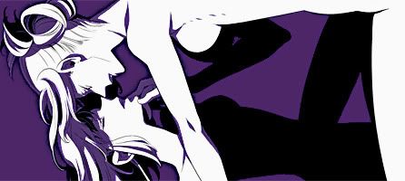
    I vectored the more jagged parts then applied a light gaussian blur. Is it any better?


    Here is a version with the vectors but no blur.


    I think with this resolution, high contrast (like dual or tri-colour images) tend to show pixellation.
    <img src=https://ibb.co/1dDDk6w border=0 alt= />
    Peace.

  19. #6439
    It wasn't much Archangel's Avatar
    Join Date
    Feb 2008
    Location
    Portugal
    Age
    34
    Posts
    10,833
    Blog Entries
    3
    First one looks blurry, second one still looks too sharp and honestly i'm not a fan of the idea in general. If i had to choose, I'd go with the second one after some manually applied light blurring around the edges.

  20. #6440
    Pit Lord shinta|hikari's Avatar
    Join Date
    Jan 2006
    Location
    The Pits
    Age
    37
    Posts
    10,484
    Blog Entries
    1
    Blurring parts of it make it look like crap. Blurring just doesn't work with dual colour images.
    <img src=https://ibb.co/1dDDk6w border=0 alt= />
    Peace.

Posting Permissions

  • You may not post new threads
  • You may not post replies
  • You may not post attachments
  • You may not edit your posts
  •